



Scattertext 0.2.3
A tool for finding distinguishing terms in corpora and displaying them in an interactive HTML scatter plot. Points corresponding to terms are selectively labeled so that they don't overlap with other labels or points.
Cite as: Jason S. Kessler. Scattertext: a Browser-Based Tool for Visualizing how Corpora Differ. ACL System Demonstrations. 2017.
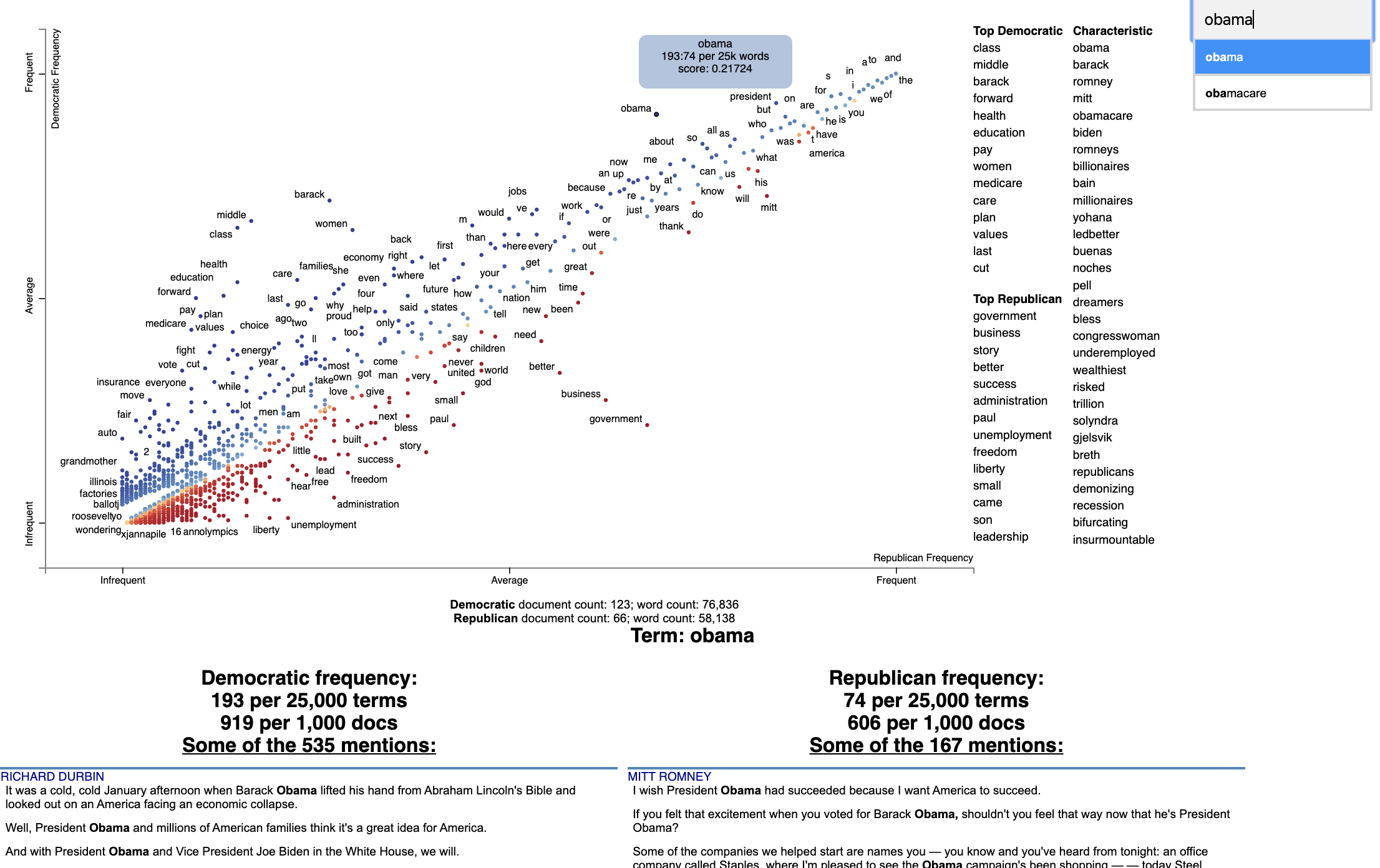
Below is an example of using Scattertext to visualize terms used in 2012 American political conventions. The 2,000 most party-associated uni grams are displayed as points in the scatter plot. Their x- and y- axes are the dense ranks of their usage by Republican and Democratic speakers respectively.
import scattertext as st

df = st.SampleCorpora.ConventionData2012.get_data().assign(
    parse=lambda df: df.text.apply(st.whitespace_nlp_with_sentences)
)

corpus = st.CorpusFromParsedDocuments(
    df, category_col='party', parsed_col='parse'
).build().get_unigram_corpus().compact(st.AssociationCompactor(2000))

html = st.produce_scattertext_explorer(
    corpus,
    category='democrat',
    category_name='Democratic',
    not_category_name='Republican',
    minimum_term_frequency=0,
    pmi_threshold_coefficient=0,
    width_in_pixels=1000,
    metadata=corpus.get_df()['speaker'],
    transform=st.Scalers.dense_rank,
    include_gradient=True,
    left_gradient_term='More Republican',
    middle_gradient_term='Metric: Dense Rank Difference',
    right_gradient_term='More Democratic',
    enable_zoom=True,
)
open('./demo_compact.html', 'w').write(html)
The HTML file written would look like the image below. Click on it for the actual interactive visualization. With
enable_zoom=True, the scatter plot supports mouse-wheel or trackpad zooming and drag panning.
Citation
Jason S. Kessler. Scattertext: a Browser-Based Tool for Visualizing how Corpora Differ. ACL System Demonstrations. 2017. Link to paper: arxiv.org/abs/1703.00565
@article{kessler2017scattertext,
  author    = {Kessler, Jason S.},
  title     = {Scattertext: a Browser-Based Tool for Visualizing how Corpora Differ},
  booktitle = {Proceedings of ACL-2017 System Demonstrations},
  year      = {2017},
  address   = {Vancouver, Canada},
  publisher = {Association for Computational Linguistics},
}
Table of Contents
-
- Help! I don't know Python but I still want to use Scattertext
- Using Scattertext as a text analysis library: finding characteristic terms and their associations
- Visualizing term associations
- Visualizing phrase associations
- Adding color gradients to explain scores
- Visualizing Empath topics and categories
- Visualizing the Moral Foundations 2.0 Dictionary
- Ordering Terms by Corpus Characteristicness
- Document-Based Scatter Plots
- Using Cohen's d or Hedge's g to visualize effect size
- Using Cliff's Delta to visualize effect size
- Using Bi-Normal Separation (BNS) to score terms
- Using correlations to explain classifiers
- Using Custom Background Word Frequencies
- Plotting word productivity
-
- Visualizing differences based on only term frequencies
- Visualizing query-based categorical differences
- Visualizing any kind of term score
- Custom term positions
- Emoji analysis
- Visualizing SentencePiece tokens
- Visualizing scikit-learn text classification weights
- Creating lexicalized semiotic squares
- Visualizing topic models
- Creating T-SNE-style word embedding projection plots
- Using SVD to visualize any kind of word embeddings
- Exporting plot to matplotlib
- Creating Zoomable Scatter Plots
- Using the same scale for both axes
Installation
Install Python 3.11 or higher and run:
$ pip install scattertext
If you cannot (or don't want to) install spaCy, substitute nlp = spacy.load('en') lines with
nlp = scattertext.WhitespaceNLP.whitespace_nlp. Note, this is not compatible
with word_similarity_explorer, and the tokenization and sentence boundary detection
capabilities will be low-performance regular expressions. See demo_without_spacy.py
for an example.
It is recommended you install jieba, spacy, empath, astropy, flashtext, gensim and umap-learn in order to
take full advantage of Scattertext.
Scattertext should mostly work with Python 2.7, but it may not.
The HTML outputs look best in Chrome and Safari.
Style Guide
The name of this project is Scattertext. "Scattertext" is written as a single word
and should be capitalized. When used in Python, the package scattertext should be defined
to the name st, i.e., import scattertext as st.
Overview
This is a tool that is intended for visualizing what words and phrases are more characteristic of a category than others.
Consider the example at the top of the page.
Looking at this seem overwhelming. In fact, it's a relatively simple visualization of word use during the 2012 political convention. Each dot corresponds to a word or phrase mentioned by Republicans or Democrats during their conventions. The closer a dot is to the top of the plot, the more frequently it was used by Democrats. The further right a dot, the more that word or phrase was used by Republicans. Words frequently used by both parties, like "of" and "the" and even "Mitt" tend to occur in the upper-right-hand corner. Although very low frequency words have been hidden to preserve computing resources, a word that neither party used, like "giraffe" would be in the bottom-left-hand corner.
The interesting things happen close to the upper-left and lower-right corners. In the upper-left corner, words like "auto" (as in auto bailout) and "millionaires" are frequently used by Democrats but infrequently or never used by Republicans. Likewise, terms frequently used by Republicans and infrequently by Democrats occupy the bottom-right corner. These include "big government" and "olympics", referring to the Salt Lake City Olympics in which Gov. Romney was involved.
Terms are colored by their association. Those that are more associated with Democrats are blue, and those more associated with Republicans red.
Terms that are most characteristic of the both sets of documents are displayed on the far-right of the visualization.
The inspiration for this visualization came from Dataclysm (Rudder, 2014).
Scattertext is designed to help you build these graphs and efficiently label points on them.
Scatter plots can also be made zoomable by passing enable_zoom=True to produce_scattertext_explorer or related
visualization functions.
The documentation (including this readme) is a work in progress. Please see the tutorial below as well as the PyData 2017 Tutorial.
Poking around the code and tests should give you a good idea of how things work.
The library covers some novel and effective term-importance formulas, including Scaled F-Score.
Customizing the Visualization and Plotting Dispersion
New in Scattertext 0.1.0, one can use a dataframe for term/metadata positions and other term-specific data. We can also use it to determine term-specific information which is shown after a term is clicked.
Note that it is possible to disable the use of document categories in Scattertext, as we shall see in this example.
This example covers plotting term dispersion against word frequency and identifying the terms which are most and least dispersed given their frequencies. Using the Rosengren's S dispersion measure (Gries 2021), terms tend to increase in their dispersion scores as they get more frequent. We'll see how we can both plot this effect and factor out the effect of frequency.
This, along with a number of other dispersion metrics presented in Gries (2021), are available and documented
in the Dispersion class, which we'll use later in the section.
Let's start by creating a Convention corpus, but we'll use the CorpusWithoutCategoriesFromParsedDocuments factory
to ensure that no categories are included in the corpus. If we try to find document categories, we'll see that
all documents have the category '_'.
import scattertext as st

df = st.SampleCorpora.ConventionData2012.get_data().assign(
    parse=lambda df: df.text.apply(st.whitespace_nlp_with_sentences))
corpus = st.CorpusWithoutCategoriesFromParsedDocuments(
    df, parsed_col='parse'
).build().get_unigram_corpus().remove_infrequent_words(minimum_term_count=6)

corpus.get_categories()
# Returns ['_']
Next, we'll create a dataframe for all terms we'll plot. We'll just start by creating a dataframe where we capture the frequency of each term and various dispersion metrics. These will be shown after a term is activated in the plot.
dispersion = st.Dispersion(corpus)

dispersion_df = dispersion.get_df()
dispersion_df.head(3)
Which returns
Frequency Range SD VC Juilland's D Rosengren's S DP DP norm KL-divergence Dissemination
thank 363 134 3.108113 1.618274 0.707416 0.694898 0.391548 0.391560 0.748808 0.972954
you 1630 177 12.383708 1.435902 0.888596 0.898805 0.233627 0.233635 0.263337 0.963905
so 549 155 3.523380 1.212967 0.774299 0.822244 0.283151 0.283160 0.411750 0.986423```
These are discussed in detail in [Gries 2021](http://www.stgries.info/research/ToApp_STG_Dispersion_PHCL.pdf).
Dissementation is presented in Altmann et al. (2011).
We'll use Rosengren's S to find the dispersion of each term. It's which a metric designed for corpus parts
(convention speeches in our case) of varying length. Where n is the number of documents in the corpus, s_i is the
percentage of tokens in the corpus found in document i, v_i is term count in document i, and f is the total number
of tokens in the corpus of type term type.
Rosengren's
S: [^2}{f})](https://render.githubusercontent.com/render/math?math=\frac{\Sum_{i=1}^{n}\sqrt{s_i%20\cdot%20\v_i})
^2}{f})
In order to start plotting, we'll need to add coordinates for each term to the data frame.
To use the `dataframe_scattertext` function, you need, at a minimum a dataframe with 'X' and 'Y' columns.
The `Xpos` and `Ypos` columns indicate the positions of the original `X` and `Y` values on the scatterplot, and
need to be between 0 and 1. Functions in `st.Scalers` perform this scaling. Absent `Xpos` or `Ypos`,
`st.Scalers.scale` would be used.
Here is a sample of values:
* `st.Scalers.scale(vec)` Rescales the vector to where the minimum value is 0 and the maximum is 1.
* `st.Scalers.log_scale(vec)` Rescales the lgo of the vector
* `st.Scalers.dense_ranke(vec)` Rescales the dense rank of the vector
* `st.Scalers.scale_center_zero_abs(vec)` Rescales a vector with both positive and negative values such that the 0 value
in the original vector is plotted at 0.5, negative values are projected from [-argmax(abs(vec)), 0] to [0, 0.5] and
positive values projected from [0, argmax(abs(vec))] to [0.5, 1].
```python
dispersion_df = dispersion_df.assign(
X=lambda df: df.Frequency,
Xpos=lambda df: st.Scalers.log_scale(df.X),
Y=lambda df: df["Rosengren's S"],
Ypos=lambda df: st.Scalers.scale(df.Y),
)
Note that the Ypos column here is not necessary since Y would automatically be scaled.
Finally, since we are not distinguishing between categories, we can set ignore_categories=True.
We can now plot this graph using the dataframe_scattertext function:
html = st.dataframe_scattertext(
    corpus,
    plot_df=dispersion_df,
    metadata=corpus.get_df()['speaker'] + ' (' + corpus.get_df()['party'].str.upper() + ')',
    ignore_categories=True,
    x_label='Log Frequency',
    y_label="Rosengren's S",
    y_axis_labels=['Less Dispersion', 'Medium', 'More Dispersion'],
)
Which yields (click for an interactive version):
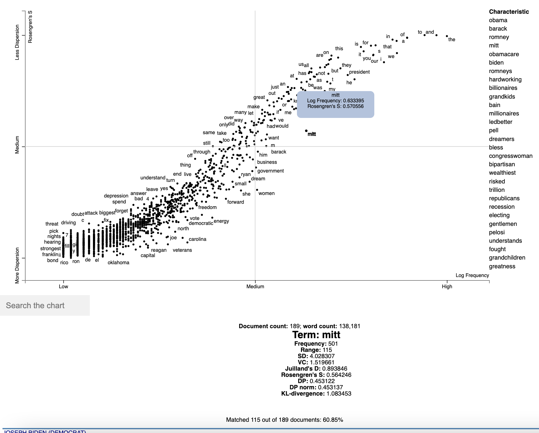
Note that we can see various dispersion statistics under a term's name, in addition to the standard usage statistics. To
customize the statistics which are displayed, set the term_description_column=[...] parameter with a list of column
names to be displayed.
One issue in this dispersion chart, which tends to be common to dispersion metrics in general, is that dispersion and frequency tend to have a high correlation, but with a complex, non-linear curve. Depending on the metric, this correlation curve could be power, linear, sigmoidal, or typically, something else.
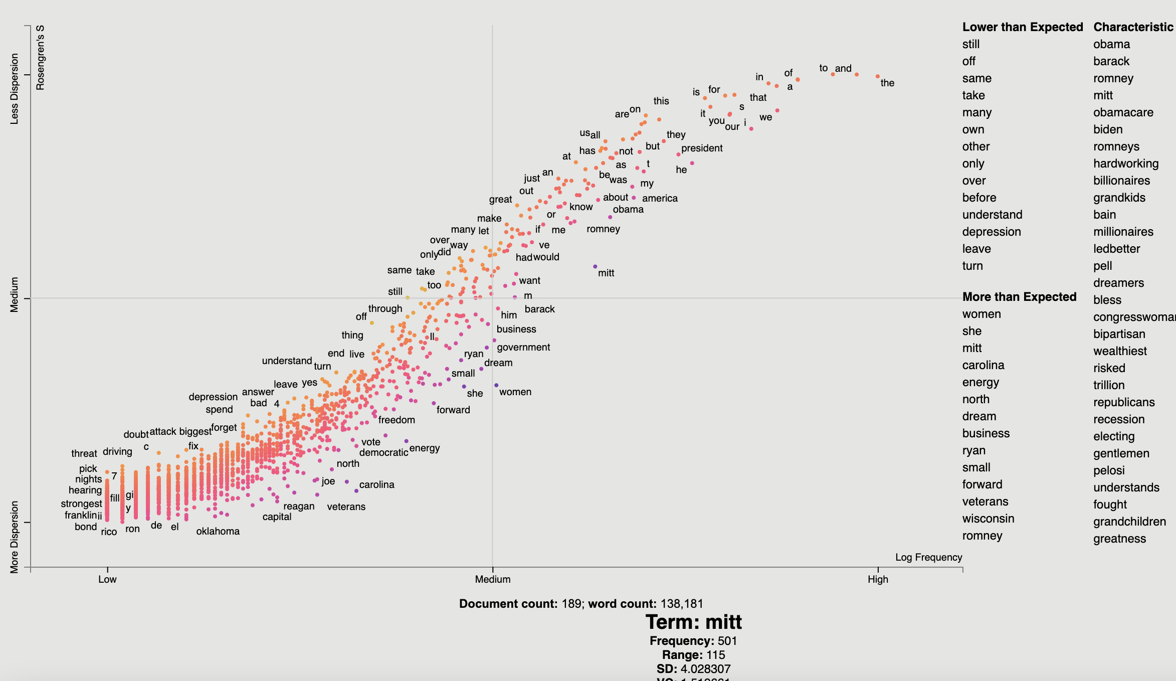
In order to factor out this correlation, we can predict the dispersion from frequency using a non-parametric regressor, and see which terms have the highest and lowest residuals with respect to their expected dispersions based on their frequencies.
In this case, we'll use a KNN regressor with 10 neighbors to predict Rosengren'S from term frequencies
(dispersion_df.X and .Y respectively), and compute the residual.
We'll the residual to color points, with a neutral color for residuals around 0 and other colors for positive and
negative values. We'll add a column in the data frame for point colors, and call it ColorScore. It is populated
with values between 0 and 1, with 0.5 as a netural color on the d3 interpolateWarm color scale. We use
st.Scalers.scale_center_zero_abs, discussed above, to make this transformation.
from sklearn.neighbors import KNeighborsRegressor

dispersion_df = dispersion_df.assign(
    Expected=lambda df: KNeighborsRegressor(n_neighbors=10).fit(
        df.X.values.reshape(-1, 1), df.Y
    ).predict(df.X.values.reshape(-1, 1)),
    Residual=lambda df: df.Y - df.Expected,
    ColorScore=lambda df: st.Scalers.scale_center_zero_abs(df.Residual)
)
Now we are ready to plot our colored dispersion chart. We assign the ColorScore column name to the color_score_column
parameter in dataframe_scattertext.
Additionally, We'd like to populate the two term lists on the
left with terms that have high and low residual values, indicating terms which have the most dispersion relative to
their frequency-expected level and the lowest. We can do this by the left_list_column parameter. We can specify
the upper and lower term list names using the header_names parameter. Finally, we can spiff-up the plot by
adding an appealing background color.
html = st.dataframe_scattertext(
    corpus,
    plot_df=dispersion_df,
    metadata=corpus.get_df()['speaker'] + ' (' + corpus.get_df()['party'].str.upper() + ')',
    ignore_categories=True,
    x_label='Log Frequency',
    y_label="Rosengren's S",
    y_axis_labels=['Less Dispersion', 'Medium', 'More Dispersion'],
    color_score_column='ColorScore',
    header_names={'upper': 'Lower than Expected', 'lower': 'More than Expected'},
    left_list_column='Residual',
    background_color='#e5e5e3'
)
Which yields (click for an interactive version):
Tutorial
Help! I don't know Python but I still want to use Scattertext.
While you should learn Python fully use Scattertext, I've put some of the basic functionality in a commandline tool. The tool is installed when you follow the procedure laid out above.
Run $ scattertext --help from the commandline to see the full usage information. Here's a quick example of
how to use vanilla Scattertext on a CSV file. The file needs to have at least two columns,
one containing the text to be analyzed, and another containing the category. In the example CSV below,
the columns are text and party, respectively.
The example below processes the CSV file, and the resulting HTML visualization into cli_demo.html.
ff
Note, the parameter --minimum_term_frequency=8 omit terms that occur less than 8
times, and --regex_parser indicates a simple regular expression parser should
be used in place of spaCy. The flag --one_use_per_doc indicates that term frequency
should be calculated by only counting no more than one occurrence of a term in a document.
If you'd like to parse non-English text, you can use the --spacy_language_model argument to configure which
spaCy language model the tool will use. The default is 'en' and you can see the others available at
https://spacy.io/docs/api/language-models.
$ curl -s https://cdn.rawgit.com/JasonKessler/scattertext/master/scattertext/data/political_data.csv | head -2
party,speaker,text
democrat,BARACK OBAMA,"Thank you. Thank you. Thank you. Thank you so much.Thank you.Thank you so much. Thank you. Thank you very much, everybody. Thank you.
$
$ scattertext --datafile=https://cdn.rawgit.com/JasonKessler/scattertext/master/scattertext/data/political_data.csv \
> --text_column=text --category_column=party --metadata_column=speaker --positive_category=democrat \
> --category_display_name=Democratic --not_category_display_name=Republican --minimum_term_frequency=8 \
> --one_use_per_doc --regex_parser --outputfile=cli_demo.html
Using Scattertext as a text analysis library: finding characteristic terms and their associations
The following code creates a stand-alone HTML file that analyzes words used by Democrats and Republicans in the 2012 party conventions, and outputs some notable term associations.
First, import Scattertext and spaCy.
>>> import scattertext as st
>>> import spacy
>>> from pprint import pprint
Next, assemble the data you want to analyze into a Pandas data frame. It should have
at least two columns, the text you'd like to analyze, and the category you'd like to
study. Here, the text column contains convention speeches while the party column
contains the party of the speaker. We'll eventually use the speaker column
to label snippets in the visualization.
>>> convention_df = st.SampleCorpora.ConventionData2012.get_data()
>>> convention_df.iloc[0]
party                                               democrat
speaker                                         BARACK OBAMA
text       Thank you. Thank you. Thank you. Thank you so ...
Name: 0, dtype: object
Turn the data frame into a Scattertext Corpus to begin analyzing it. To look for differences
in parties, set the category_col parameter to 'party', and use the speeches,
present in the text column, as the texts to analyze by setting the text col
parameter. Finally, pass a spaCy model in to the nlp argument and call build() to construct the corpus.
# Turn it into a Scattertext Corpus
>>> nlp = spacy.load('en')
>>> corpus = st.CorpusFromPandas(convention_df,
...                              category_col='party',
...                              text_col='text',
...                              nlp=nlp).build()
Let's see characteristic terms in the corpus, and terms that are most associated Democrats and Republicans. See slides 52 to 59 of the Turning Unstructured Content ot Kernels of Ideas talk for more details on these approaches.
Here are the terms that differentiate the corpus from a general English corpus.
>>> print(list(corpus.get_scaled_f_scores_vs_background().index[:10]))
['obama',
 'romney',
 'barack',
 'mitt',
 'obamacare',
 'biden',
 'romneys',
 'hardworking',
 'bailouts',
 'autoworkers']
Here are the terms that are most associated with Democrats:
>>> term_freq_df = corpus.get_term_freq_df()
>>> term_freq_df['Democratic Score'] = corpus.get_scaled_f_scores('democrat')
>>> pprint(list(term_freq_df.sort_values(by='Democratic Score', ascending=False).index[:10]))
['auto',
 'america forward',
 'auto industry',
 'insurance companies',
 'pell',
 'last week',
 'pell grants',
 "women 's",
 'platform',
 'millionaires']
And Republicans:
>>> term_freq_df['Republican Score'] = corpus.get_scaled_f_scores('republican')
>>> pprint(list(term_freq_df.sort_values(by='Republican Score', ascending=False).index[:10]))
['big government',
 "n't build",
 'mitt was',
 'the constitution',
 'he wanted',
 'hands that',
 'of mitt',
 '16 trillion',
 'turned around',
 'in florida']
Visualizing term associations
Now, let's write the scatter plot a stand-alone HTML file. We'll make the y-axis category "democrat", and name
the category "Democrat" with a capital "D" for presentation
purposes. We'll name the other category "Republican" with a capital "R". All documents in the corpus without
the category "democrat" will be considered Republican. We set the width of the visualization in pixels, and label
each excerpt with the speaker using the metadata parameter. Finally, we write the visualization to an HTML file.
>>> html = st.produce_scattertext_explorer(corpus,
...          category='democrat',
...          category_name='Democratic',
...          not_category_name='Republican',
...          width_in_pixels=1000,
...          metadata=convention_df['speaker'])
>>> open("Convention-Visualization.html", 'wb').write(html.encode('utf-8'))
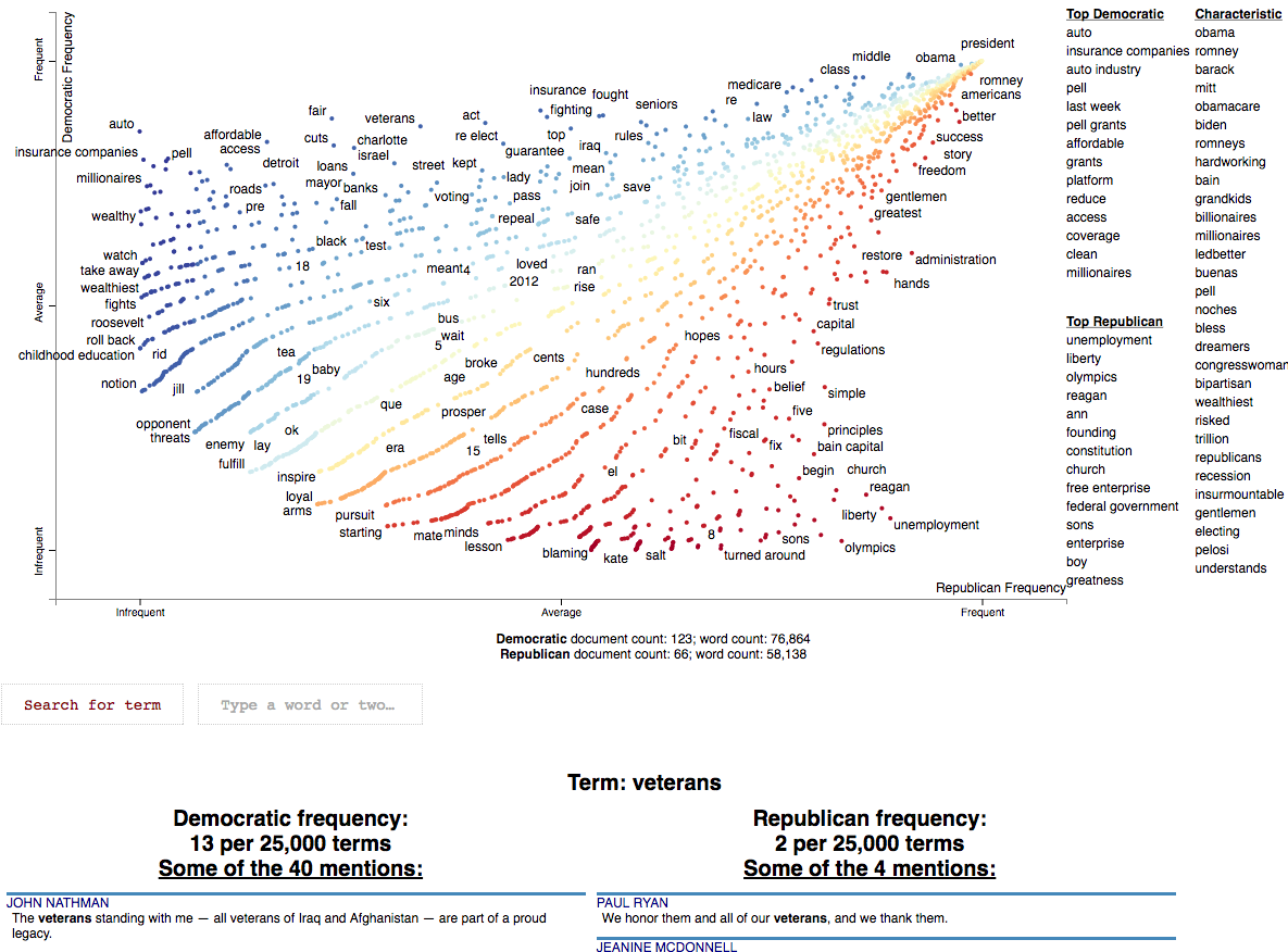
Below is what the webpage looks like. Click it and wait a few minutes for the interactive version.
Visualizing Phrase associations
Scattertext can also be used to visualize the category association of a variety of different phrase types. The word "phrase" denotes any single or multi-word collocation.
Using PyTextRank
PyTextRank, created by Paco Nathan, is an implementation of a modified version of the TextRank algorithm (Mihalcea and Tarau 2004). It involves graph centrality algorithm to extract a scored list of the most prominent phrases in a document. Here, named entities recognized by spaCy. As of spaCy version 2.2, these are from an NER system trained on Ontonotes 5.
Please install pytextrank $ pip3 install pytextrank before continuing with this tutorial.
To use, build a corpus as normal, but make sure you use spaCy to parse each document as opposed a built-in
whitespace_nlp-type tokenizer. Note that adding PyTextRank to the spaCy pipeline is not needed, as it
will be run separately by the PyTextRankPhrases object. We'll reduce the number of phrases displayed in the
chart to 2000 using the AssociationCompactor. The phrases generated will be treated like non-textual features
since their document scores will not correspond to word counts.
import pytextrank, spacy
import scattertext as st

nlp = spacy.load('en')
nlp.add_pipe("textrank", last=True)

convention_df = st.SampleCorpora.ConventionData2012.get_data().assign(
    parse=lambda df: df.text.apply(nlp),
    party=lambda df: df.party.apply({'democrat': 'Democratic', 'republican': 'Republican'}.get)
)
corpus = st.CorpusFromParsedDocuments(
    convention_df,
    category_col='party',
    parsed_col='parse',
    feats_from_spacy_doc=st.PyTextRankPhrases()
).build(
).compact(
    AssociationCompactor(2000, use_non_text_features=True)
)
Note that the terms present in the corpus are named entities, and, as opposed to frequency counts, their scores
are the eigencentrality scores assigned to them by the TextRank algorithm. Running corpus.get_metadata_freq_df('')
will return, for each category, the sums of terms' TextRank scores. The dense ranks of these scores will be used to
construct the scatter plot.
term_category_scores = corpus.get_metadata_freq_df('')
print(term_category_scores)
'''
                                         Democratic  Republican
term
our future                                 1.113434    0.699103
your country                               0.314057    0.000000
their home                                 0.385925    0.000000
our government                             0.185483    0.462122
our workers                                0.199704    0.210989
her family                                 0.540887    0.405552
our time                                   0.510930    0.410058
...
'''
Before we construct the plot, let's some helper variables Since the aggregate TextRank scores aren't particularly
interpretable, we'll display the per-category rank of each score in the metadata_description field. These will be
displayed after a term is clicked.
term_ranks = pd.DataFrame(
    np.argsort(np.argsort(-term_category_scores, axis=0), axis=0) + 1,
    columns=term_category_scores.columns,
    index=term_category_scores.index)

metadata_descriptions = {
    term: '
' + '
'.join(
        '%s TextRank score rank: %s/%s' % (cat, term_ranks.loc[term, cat], corpus.get_num_metadata())
        for cat in corpus.get_categories())
    for term in corpus.get_metadata()
}
We can construct term scores in a couple ways. One is a standard dense-rank difference, a score which is used in most of the two-category contrastive plots here, which will give us the most category-associated phrases. Another is to use the maximum category-specific score, this will give us the most prominent phrases in each category, regardless of the prominence in the other category. We'll take both approaches in this tutorial, let's compute the second kind of score, the category-specific prominence below.
category_specific_prominence = term_category_scores.apply(
    lambda r: r.Democratic if r.Democratic > r.Republican else -r.Republican,
    axis=1
)
Now we're ready output this chart. Note that we use a dense_rank transform, which places identically scalled phrases
atop each other. We use category_specific_prominence as scores, and set sort_by_dist as False to ensure the
phrases displayed on the right-hand side of the chart are ranked by the scores and not distance to the upper-left or
lower-right corners. Since matching phrases are treated as non-text features, we encode them as single-phrase topic
models and set the topic_model_preview_size to 0 to indicate the topic model list shouldn't be shown. Finally,
we set ensure the full documents are displayed. Note the documents will be displayed in order of phrase-specific score.
html = produce_scattertext_explorer(
    corpus,
    category='Democratic',
    not_category_name='Republican',
    minimum_term_frequency=0,
    pmi_threshold_coefficient=0,
    width_in_pixels=1000,
    transform=dense_rank,
    metadata=corpus.get_df()['speaker'],
    scores=category_specific_prominence,
    sort_by_dist=False,
    use_non_text_features=True,
    topic_model_term_lists={term: [term] for term in corpus.get_metadata()},
    topic_model_preview_size=0,
    metadata_descriptions=metadata_descriptions,
    use_full_doc=True
)
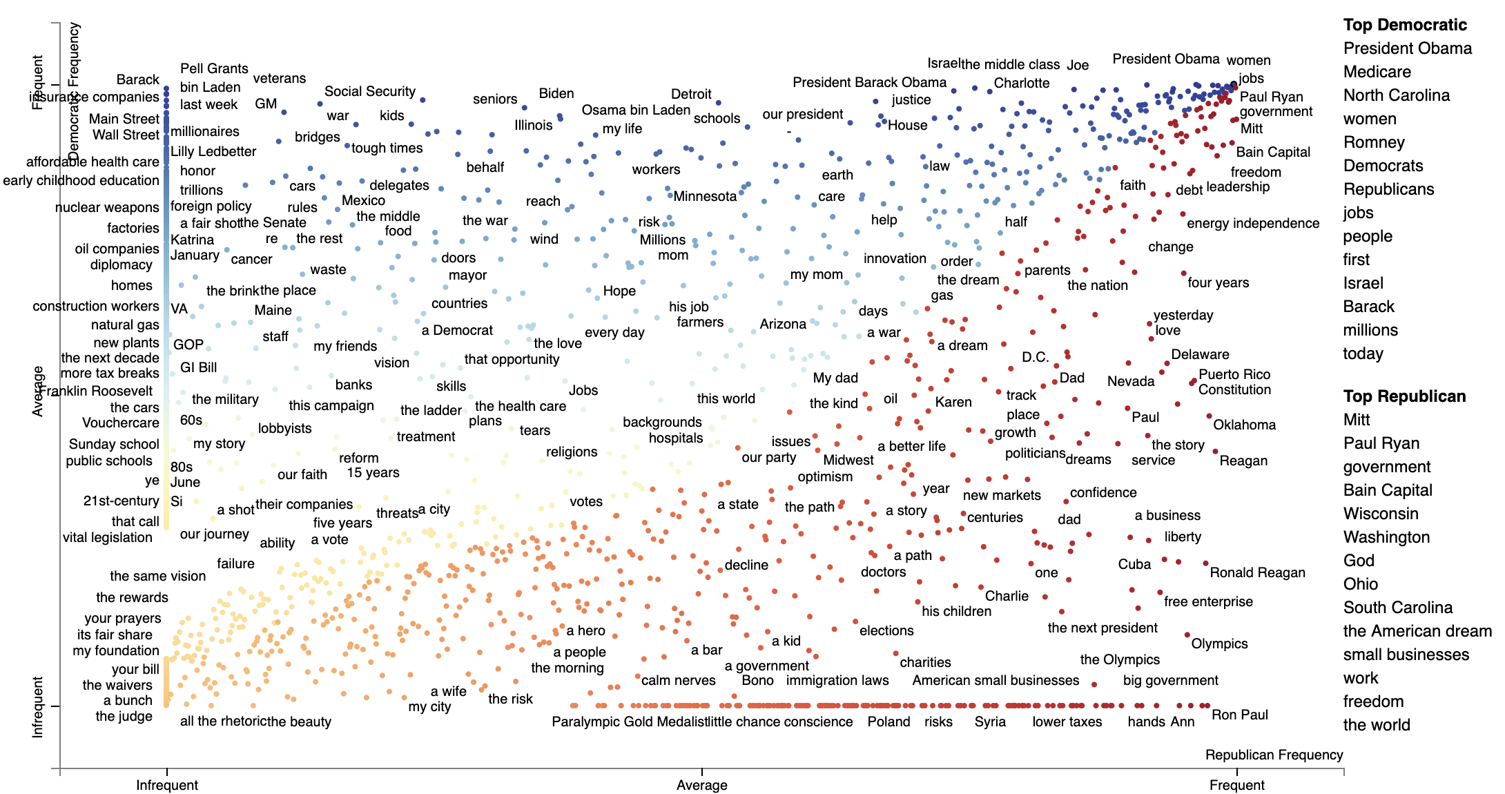
The most associated terms in each category make some sense, at least on a post hoc analysis. When referring to (then) Governor Romney, Democrats used his surname "Romney" in their most central mentions of him, while Republicans used the more familiar and humanizing "Mitt". In terms of the President Obama, the phrase "Obama" didn't show up as a top term i n either, the but the first name "Barack" was one of the the most central phrases in Democratic speeches, mirroring "Mitt."
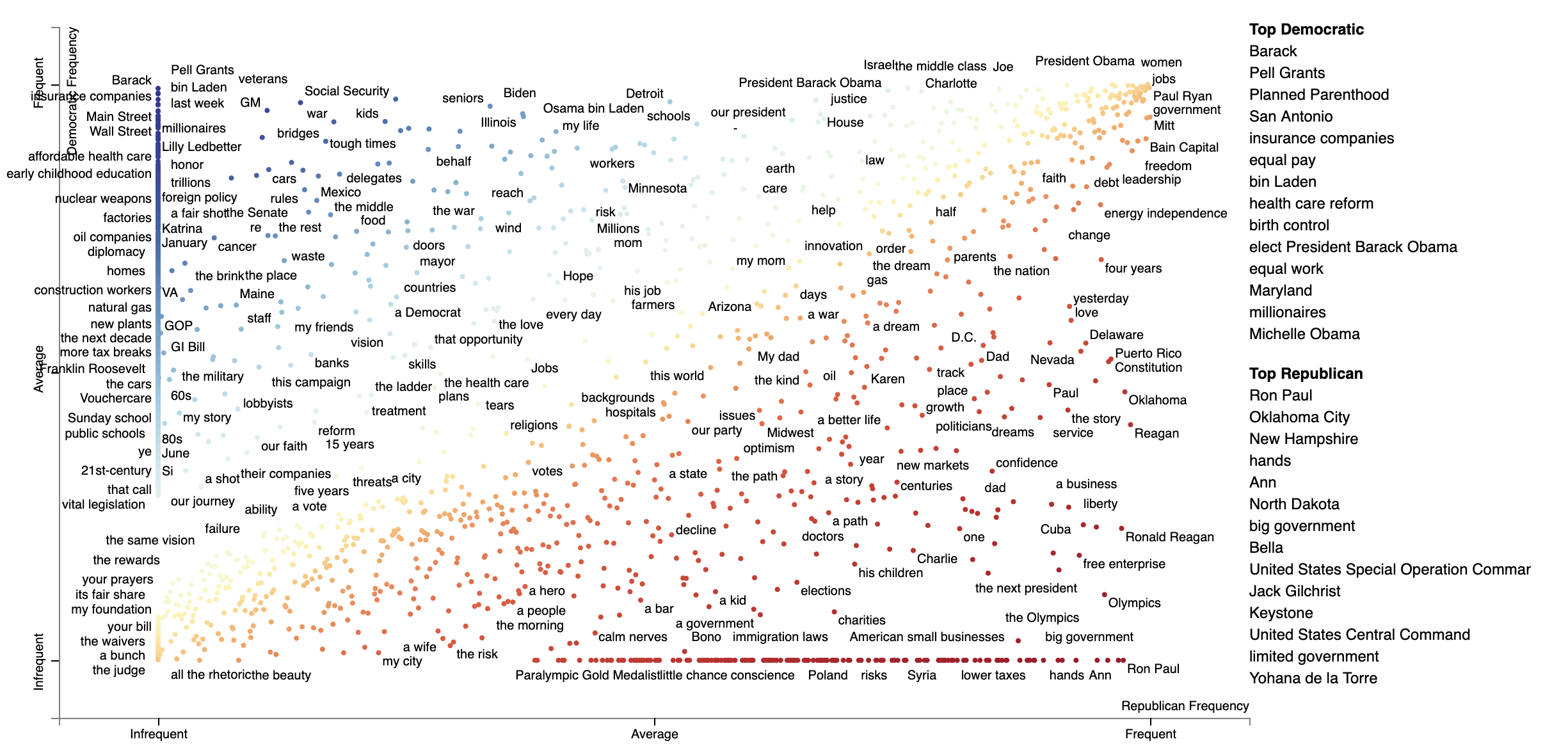
Alternatively, we can Dense Rank Difference in scores to color phrase-points and determine the top phrases to be
displayed on the right-hand side of the chart. Instead of setting scores as category-specific prominence scores,
we set term_scorer=RankDifference() to inject a way determining term scores into the scatter plot creation process.
html = produce_scattertext_explorer(
    corpus,
    category='Democratic',
    not_category_name='Republican',
    minimum_term_frequency=0,
    pmi_threshold_coefficient=0,
    width_in_pixels=1000,
    transform=dense_rank,
    use_non_text_features=True,
    metadata=corpus.get_df()['speaker'],
    term_scorer=RankDifference(),
    sort_by_dist=False,
    topic_model_term_lists={term: [term] for term in corpus.get_metadata()},
    topic_model_preview_size=0,
    metadata_descriptions=metadata_descriptions,
    use_full_doc=True
)
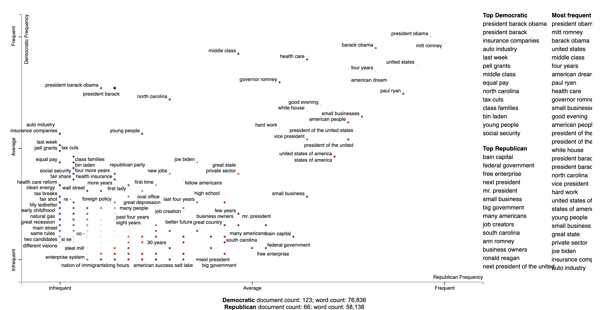
Using Phrasemachine to find phrases.
Phrasemachine from AbeHandler (Handler et al. 2016) uses regular expressions over sequences of part-of-speech tags to identify noun phrases. This has the advantage over using spaCy's NP-chunking in that it tends to isolote meaningful, large noun phases which are free of appositives.
A opposed to PyTextRank, we'll just use counts of these phrases, treating them like any other term.
import spacy
from scattertext import SampleCorpora, PhraseMachinePhrases, dense_rank, RankDifference, AssociationCompactor, produce_scattertext_explorer
from scattertext.CorpusFromPandas import CorpusFromPandas

corpus = (CorpusFromPandas(SampleCorpora.ConventionData2012.get_data(),
                           category_col='party',
                           text_col='text',
                           feats_from_spacy_doc=PhraseMachinePhrases(),
                           nlp=spacy.load('en', parser=False))
          .build().compact(AssociationCompactor(4000)))

html = produce_scattertext_explorer(corpus,
                                    category='democrat',
                                    category_name='Democratic',
                                    not_category_name='Republican',
                                    minimum_term_frequency=0,
                                    pmi_threshold_coefficient=0,
                                    transform=dense_rank,
                                    metadata=corpus.get_df()['speaker'],
                                    term_scorer=RankDifference(),
                                    width_in_pixels=1000)
Adding color gradients to explain scores
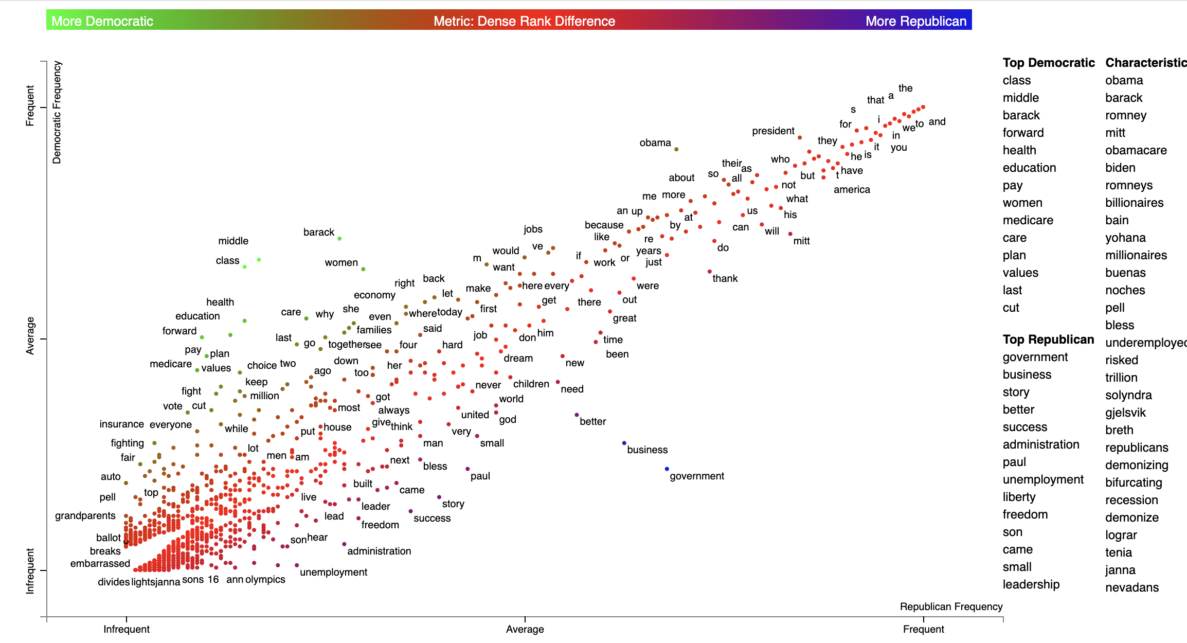
In Scattertext, various metrics, including term associations, are often shown through two ways. The first and most important, is the position in the chart. The second is the color of a point or text. In Scattertext 0.2.21, a way of visualizing the semantics of these scores is introduced: the gradient as key.
The gradient, by default, follows the d3_color_scale parameter of produce_scattertext_explorer which is
d3.interpolateRdYlBu by default.
The following additional parameters to produce_scattertext_explorer (and similar functions) allow for the manipulation
gradients.
include_gradient: bool(Falseby default) is a flag that triggers the appearance of a gradient.left_gradient_term: Optional[str]indicates the text written on the far-left side of the gradient. It is written ingradient_text_colorand iscategory_nameby default.right_gradient_term: Optional[str]indicates the text written on the far-left side of the gradient. It is written ingradient_text_colorand isnot_category_nameby default.middle_gradient_term: Optional[str]indicates the text written in the middle of the gradient. It is the opposite color of the center gradient color and is empty by default.gradient_text_color: Optional[str]indicates the fixed color of the text written on the gradient. If None, it defaults to opposite color of the gradient.left_text_color: Optional[str]overridesgradient_text_colorfor the left gradient termmiddle_text_color: Optional[str]overridesgradient_text_colorfor the middle gradient termright_text_color: Optional[str]overridesgradient_text_colorfor the right gradient termgradient_colors: Optional[List[str]]list of hex colors, including '#', (e.g.,['#0000ff', '#980067', '#cc3300', '#32cd00']) which describe the gradient. If given, these overrided3_color_scale.
A straightforward example is as follows. Term colors are defined as a mapping between a term name and a #RRGGBB color
as part of the term_color parameter, and the color gradient is defined in gradient_colors. THe
import matplotlib.pyplot as plt
import matplotlib as mpl

df = st.SampleCorpora.ConventionData2012.get_data().assign(
    parse=lambda df: df.text.apply(st.whitespace_nlp_with_sentences)
)

corpus = st.CorpusFromParsedDocuments(
    df, category_col='party', parsed_col='parse'
).build().get_unigram_corpus().compact(st.AssociationCompactor(2000))

html = st.produce_scattertext_explorer(
    corpus,
    category='democrat',
    category_name='Democratic',
    not_category_name='Republican',
    minimum_term_frequency=0,
    pmi_threshold_coefficient=0,
    width_in_pixels=1000,
    metadata=corpus.get_df()['speaker'],
    transform=st.Scalers.dense_rank,
    include_gradient=True,
    left_gradient_term="More Democratic",
    right_gradient_term="More Republican",
    middle_gradient_term='Metric: Dense Rank Difference',
    gradient_text_color="white",
    term_colors=dict(zip(
        corpus.get_terms(),
        [
            mpl.colors.to_hex(x) for x in plt.get_cmap('brg')(
                st.Scalers.scale_center_zero_abs(
                    st.RankDifferenceScorer(corpus).set_categories('democrat').get_scores()).values
            )
        ]
    )),
    gradient_colors=[mpl.colors.to_hex(x) for x in plt.get_cmap('brg')(np.arange(1., 0., -0.01))],
)
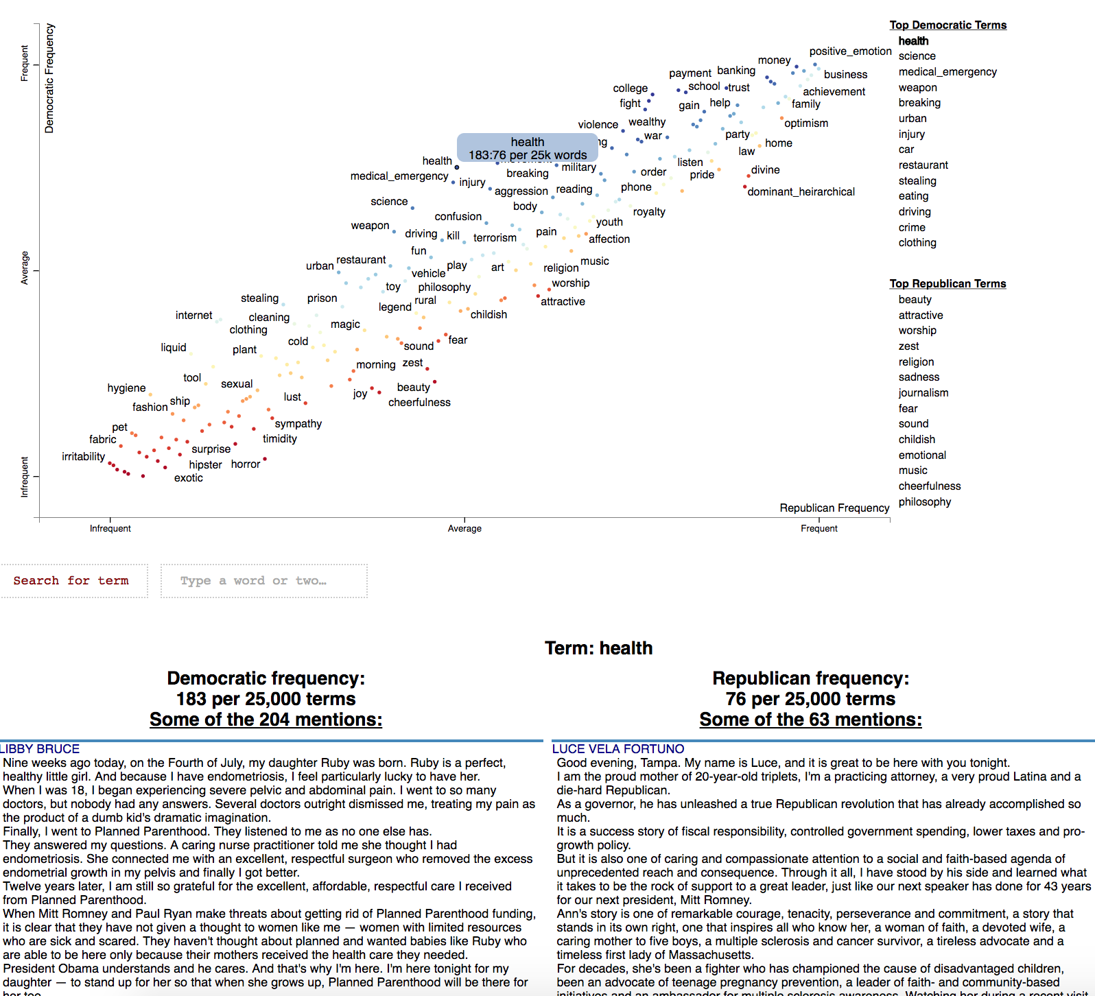
Visualizing Empath topics and categories
In order to visualize Empath (Fast et al., 2016) topics and categories instead of terms, we'll need to
create a Corpus of extracted topics and categories rather than unigrams and
bigrams. To do so, use the FeatsOnlyFromEmpath feature extractor. See the source code for
examples of how to make your own.
When creating the visualization, pass the use_non_text_features=True argument into
produce_scattertext_explorer. This will instruct it to use the labeled Empath
topics and categories instead of looking for terms. Since the documents returned
when a topic or category label is clicked will be in order of the document-level
category-association strength, setting use_full_doc=True makes sense, unless you have
enormous documents. Otherwise, the first 300 characters will be shown.
(New in 0.0.26). Ensure you include topic_model_term_lists=feat_builder.get_top_model_term_lists()
in produce_scattertext_explorer to ensure it bolds passages of snippets that match the
topic model.
>>> feat_builder = st.FeatsFromOnlyEmpath()
>>> empath_corpus = st.CorpusFromParsedDocuments(convention_df,
...                                              category_col='party',
...                                              feats_from_spacy_doc=feat_builder,
...                                              parsed_col='text').build()
>>> html = st.produce_scattertext_explorer(empath_corpus,
...                                        category='democrat',
...                                        category_name='Democratic',
...                                        not_category_name='Republican',
...                                        width_in_pixels=1000,
...                                        metadata=convention_df['speaker'],
...                                        use_non_text_features=True,
...                                        use_full_doc=True,
...                                        topic_model_term_lists=feat_builder.get_top_model_term_lists())
>>> open("Convention-Visualization-Empath.html", 'wb').write(html.encode('utf-8'))
c
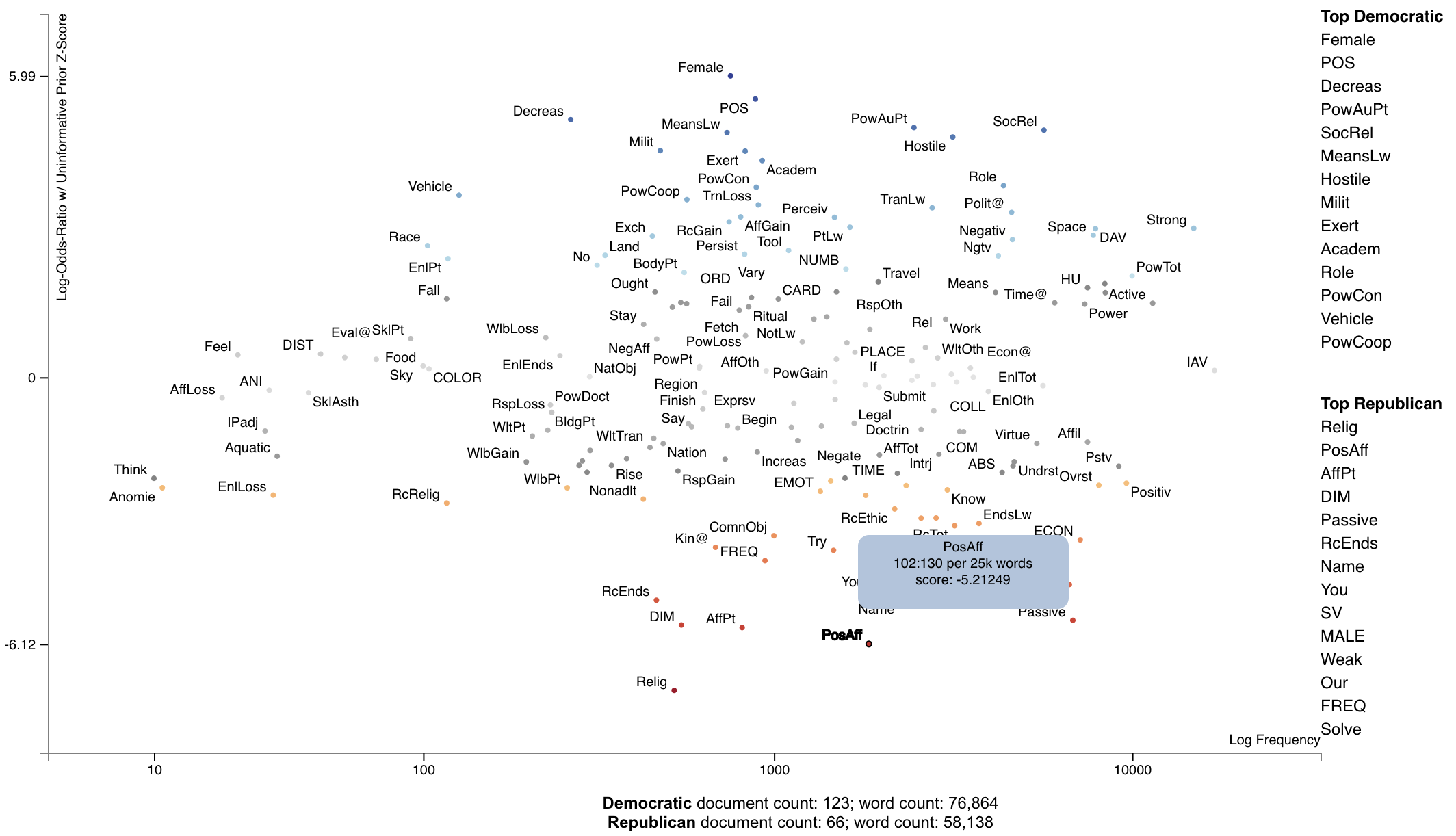
Scattertext also includes a feature builder to explore the relationship between General Inquirer Tag Categoires
and Document Categories. We'll use a slightly different approach, looking at relationship of GI Tag Categories to
political parties by using the
Z-Scores of the Log-Odds-Ratio with Uninformative Dirichlet Priors (Monroe 2008). We'll use
the produce_frequency_explorer plot
variation to visualize this relationship, setting the x-axis as the number of times a word in the tag category occurs,
and the y-axis as the z-score.
For more information on the General Inquirer, please see the General Inquirer Home Page.
We'll use the same data set as before, except we'll use the FeatsFromGeneralInquirer feature builder.
>>> general_inquirer_feature_builder = st.FeatsFromGeneralInquirer()
>>> corpus = st.CorpusFromPandas(convention_df,
...                              category_col='party',
...                              text_col='text',
...                              nlp=st.whitespace_nlp_with_sentences,
...                              feats_from_spacy_doc=general_inquirer_feature_builder).build()
Next, we'll call produce_frequency_explorer in a similar way we called produce_scattertext_explorer in the previous
section.
There are a few differences, however. First, we specify the LogOddsRatioUninformativeDirichletPrior term scorer, which
scores the relationships between the categories. The grey_threshold indicates the points scoring between [-1.96, 1.96]
(i.e., p > 0.05) should be colored gray. The
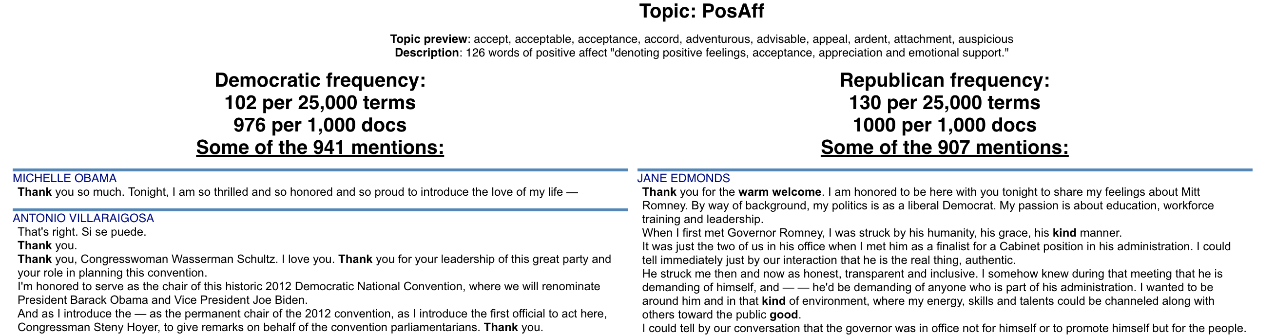
argument metadata_descriptions=general_inquirer_feature_builder.get_definitions()
indicates that a dictionary mapping the tag name to a string definition is passed. When a tag is clicked, the definition
in the dictionary will be shown below the plot, as shown in the image following the snippet.
>>> html = st.produce_frequency_explorer(corpus,
...                                      category='democrat',
...                                      category_name='Democratic',
...                                      not_category_name='Republican',
...                                      metadata=convention_df['speaker'],
...                                      use_non_text_features=True,
...                                      use_full_doc=True,
...                                      term_scorer=st.LogOddsRatioUninformativeDirichletPrior(),
...                                      grey_threshold=1.96,
...                                      width_in_pixels=1000,
...                                      topic_model_term_lists=general_inquirer_feature_builder.get_top_model_term_lists(),
...                                      metadata_descriptions=general_inquirer_feature_builder.get_definitions())
Here's the resulting chart.
Visualizing the Moral Foundations 2.0 Dictionary
The [Moral Foundations Theory] proposes six psychological constructs as building blocks of moral thinking, as described in Graham et al. (2013). These foundations are, as described on [moralfoundations.org]: care/harm, fairness/cheating, loyalty/betrayal, authority/subversion, sanctity/degradation, and liberty/oppression. Please see the site for a more in-depth discussion of these foundations.
Frimer et al. (2019) created the Moral Foundations Dictionary 2.0, or a lexicon of terms which invoke a moral foundation as a virtue (favorable toward the foundation) or a vice (in opposition to the foundation).
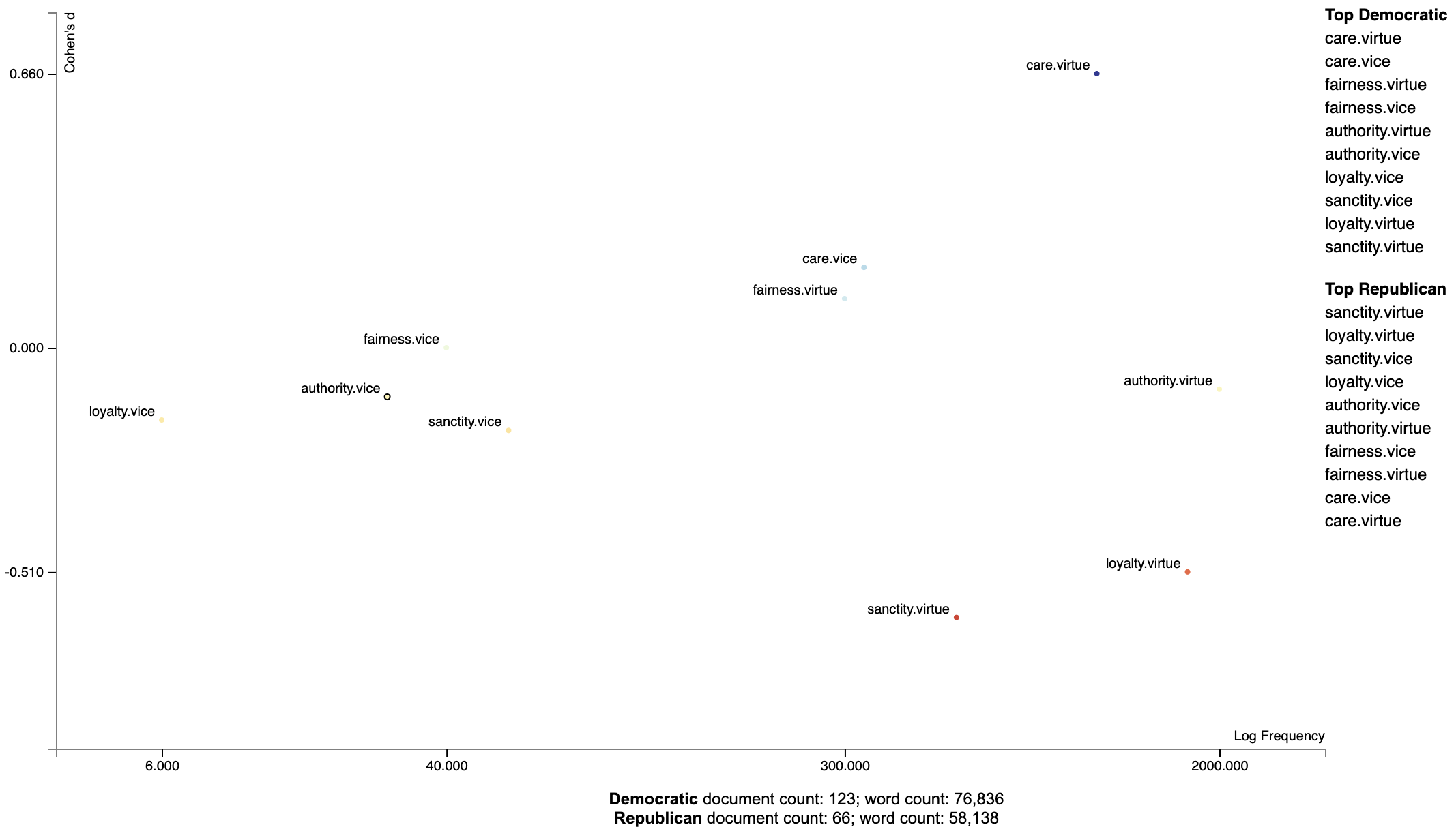
This dictionary can be used in the same way as the General Inquirer. In this example, we can plot the Cohen's d scores of foundation-word counts relative to the frequencies words involving those foundations were invoked.
We can first load the corpus as normal, and use st.FeatsFromMoralFoundationsDictionary() to extract features.
import scattertext as st

convention_df = st.SampleCorpora.ConventionData2012.get_data()
moral_foundations_feats = st.FeatsFromMoralFoundationsDictionary()
corpus = st.CorpusFromPandas(convention_df,
                             category_col='party',
                             text_col='text',
                             nlp=st.whitespace_nlp_with_sentences,
                             feats_from_spacy_doc=moral_foundations_feats).build()
Next, let's use Cohen's d term scorer to analyze the corpus, and describe a set of Cohen's d association scores.
cohens_d_scorer = st.CohensD(corpus).use_metadata()
term_scorer = cohens_d_scorer.set_categories('democrat', ['republican']).term_scorer.get_score_df()
Which yields the following data frame:
| cohens_d | cohens_d_se | cohens_d_z | cohens_d_p | hedges_g | hedges_g_se | hedges_g_z | hedges_g_p | m1 | m2 | count1 | count2 | docs1 | docs2 | |
|---|---|---|---|---|---|---|---|---|---|---|---|---|---|---|
| care.virtue | 0.662891 | 0.149425 | 4.43629 | 4.57621e-06 | 0.660257 | 0.159049 | 4.15129 | 1.65302e-05 | 0.195049 | 0.12164 | 760 | 379 | 115 | 54 |
| care.vice | 0.24435 | 0.146025 | 1.67335 | 0.0471292 | 0.243379 | 0.152654 | 1.59432 | 0.0554325 | 0.0580005 | 0.0428358 | 244 | 121 | 80 | 41 |
| fairness.virtue | 0.176794 | 0.145767 | 1.21286 | 0.112592 | 0.176092 | 0.152164 | 1.15725 | 0.123586 | 0.0502469 | 0.0403369 | 225 | 107 | 71 | 39 |
| fairness.vice | 0.0707162 | 0.145528 | 0.485928 | 0.313509 | 0.0704352 | 0.151711 | 0.464273 | 0.321226 | 0.00718627 | 0.00573227 | 32 | 14 | 21 | 10 |
| authority.virtue | -0.0187793 | 0.145486 | -0.12908 | 0.551353 | -0.0187047 | 0.15163 | -0.123357 | 0.549088 | 0.358192 | 0.361191 | 1281 | 788 | 122 | 66 |
| authority.vice | -0.0354164 | 0.145494 | -0.243422 | 0.596161 | -0.0352757 | 0.151646 | -0.232619 | 0.591971 | 0.00353465 | 0.00390602 | 20 | 14 | 14 | 10 |
| sanctity.virtue | -0.512145 | 0.147848 | -3.46399 | 0.999734 | -0.51011 | 0.156098 | -3.26788 | 0.999458 | 0.0587987 | 0.101677 | 265 | 309 | 74 | 48 |
| sanctity.vice | -0.108011 | 0.145589 | -0.74189 | 0.770923 | -0.107582 | 0.151826 | -0.708585 | 0.760709 | 0.00845048 | 0.0109339 | 35 | 28 | 23 | 20 |
| loyalty.virtue | -0.413696 | 0.147031 | -2.81367 | 0.997551 | -0.412052 | 0.154558 | -2.666 | 0.996162 | 0.259296 | 0.309776 | 1056 | 717 | 119 | 66 |
| loyalty.vice | -0.0854683 | 0.145549 | -0.587213 | 0.72147 | -0.0851287 | 0.151751 | -0.560978 | 0.712594 | 0.00124518 | 0.00197022 | 5 | 5 | 5 | 4 |
This data frame gives us Cohen's d scores (and their standard errors and z-scores), Hedge's $g$ scores (ditto), the mean document-length normalized topic usage per category (where the in-focus category is m1 [in this case Democrats] and the out-of-focus is m2), the raw number of words used in for each topic (count1 and count2), and the number of documents in each category with the topic (docs1 and docs2).
Note that Cohen's d is the difference of m1 and m2 divided by their pooled standard deviation.
Now, let's plot the d-scores of foundations vs. their frequencies.
html = st.produce_frequency_explorer(
    corpus,
    category='democrat',
    category_name='Democratic',
    not_category_name='Republican',
    metadata=convention_df['speaker'],
    use_non_text_features=True,
    use_full_doc=True,
    term_scorer=st.CohensD(corpus).use_metadata(),
    grey_threshold=0,
    width_in_pixels=1000,
    topic_model_term_lists=moral_foundations_feats.get_top_model_term_lists(),
    metadata_descriptions=moral_foundations_feats.get_definitions()
)
Ordering Terms by Corpus Characteristicness
Often the terms of most interest are ones that are characteristic to the corpus as a whole. These are terms which occur frequently in all sets of documents being studied, but relatively infrequent compared to general term frequencies.
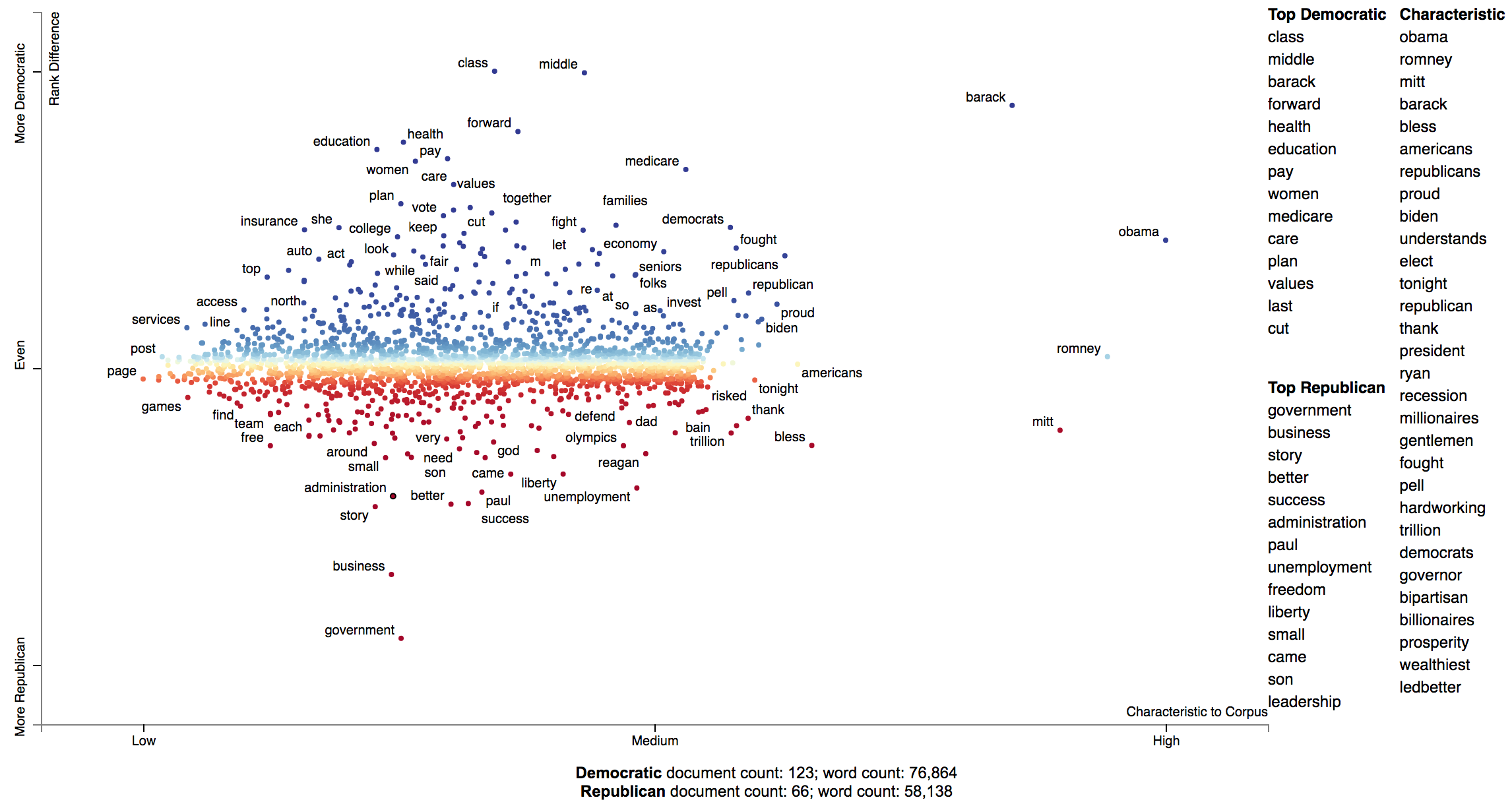
We can produce a plot with a characteristic score on the x-axis and class-association scores on the y-axis using the
function produce_characteristic_explorer.
Corpus characteristicness is the difference in dense term ranks between the words in all of the documents in the study and a general English-language frequency list. See this Talk on Term-Class Association Scores for a more thorough explanation.
import scattertext as st

corpus = (st.CorpusFromPandas(st.SampleCorpora.ConventionData2012.get_data(),
                              category_col='party',
                              text_col='text',
                              nlp=st.whitespace_nlp_with_sentences)
          .build()
          .get_unigram_corpus()
          .compact(st.ClassPercentageCompactor(term_count=2,
                                               term_ranker=st.OncePerDocFrequencyRanker)))
html = st.produce_characteristic_explorer(
    corpus,
    category='democrat',
    category_name='Democratic',
    not_category_name='Republican',
    metadata=corpus.get_df()['speaker']
)
open('demo_characteristic_chart.html', 'wb').write(html.encode('utf-8'))
Document-Based Scatter Plots
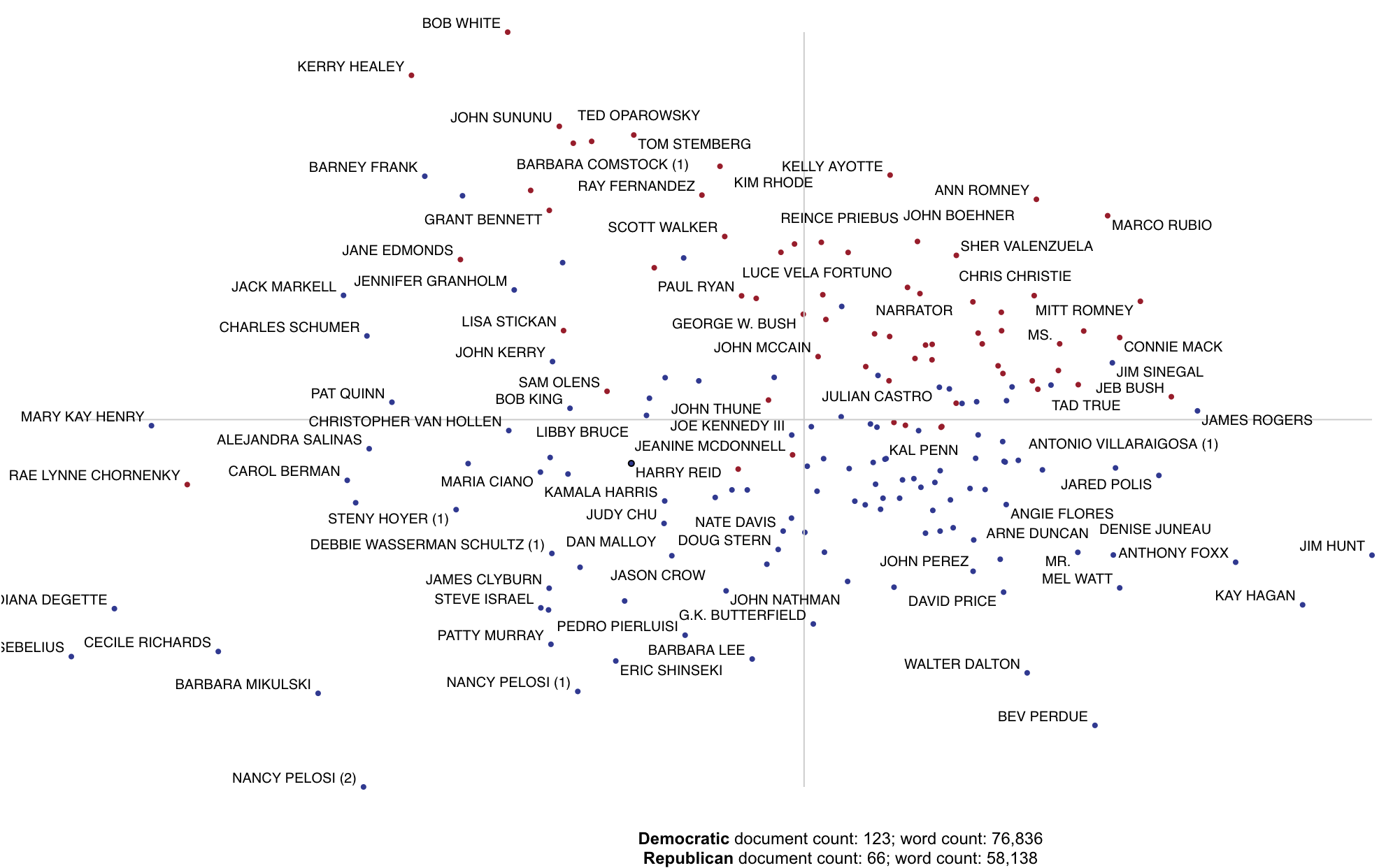
In addition to words, phases and topics, we can make each point correspond to a document. Let's first create
a corpus object for the 2012 Conventions data set. This explanation follows demo_pca_documents.py
import pandas as pd
from sklearn.feature_extraction.text import TfidfTransformer
import scattertext as st
from scipy.sparse.linalg import svds

convention_df = st.SampleCorpora.ConventionData2012.get_data()
convention_df['parse'] = convention_df['text'].apply(st.whitespace_nlp_with_sentences)
corpus = (st.CorpusFromParsedDocuments(convention_df,
                                       category_col='party',
                                       parsed_col='parse')
          .build()
          .get_stoplisted_unigram_corpus())
Next, let's add the document names as meta data in the corpus object. The add_doc_names_as_metadata function
takes an array of document names, and populates a new corpus' meta data with those names. If two documents have the
same name, it appends a number (starting with 1) to the name.
corpus = corpus.add_doc_names_as_metadata(corpus.get_df()['speaker'])
Next, we find tf.idf scores for the corpus' term-document matrix, run sparse SVD, and add them to a projection data frame, making the x and y-axes the first two singular values, and indexing it on the corpus' meta data, which corresponds to the document names.
embeddings = TfidfTransformer().fit_transform(corpus.get_term_doc_mat())
u, s, vt = svds(embeddings, k=3, maxiter=20000, which='LM')
projection = pd.DataFrame({'term': corpus.get_metadata(), 'x': u.T[0], 'y': u.T[1]}).set_index('term')
Finally, set scores as 1 for Democrats and 0 for Republicans, rendering Republican documents as red points and
Democratic documents as blue. For more on the produce_pca_explorer function,
see Using SVD to visualize any kind of word embeddings.
category = 'democrat'
scores = (corpus.get_category_ids() == corpus.get_categories().index(category)).astype(int)
html = st.produce_pca_explorer(corpus,
                               category=category,
                               category_name='Democratic',
                               not_category_name='Republican',
                               metadata=convention_df['speaker'],
                               width_in_pixels=1000,
                               show_axes=False,
                               use_non_text_features=True,
                               use_full_doc=True,
                               projection=projection,
                               scores=scores,
                               show_top_terms=False)
Click for an interactive version
Using Cohen's d or Hedge's g to visualize effect size.
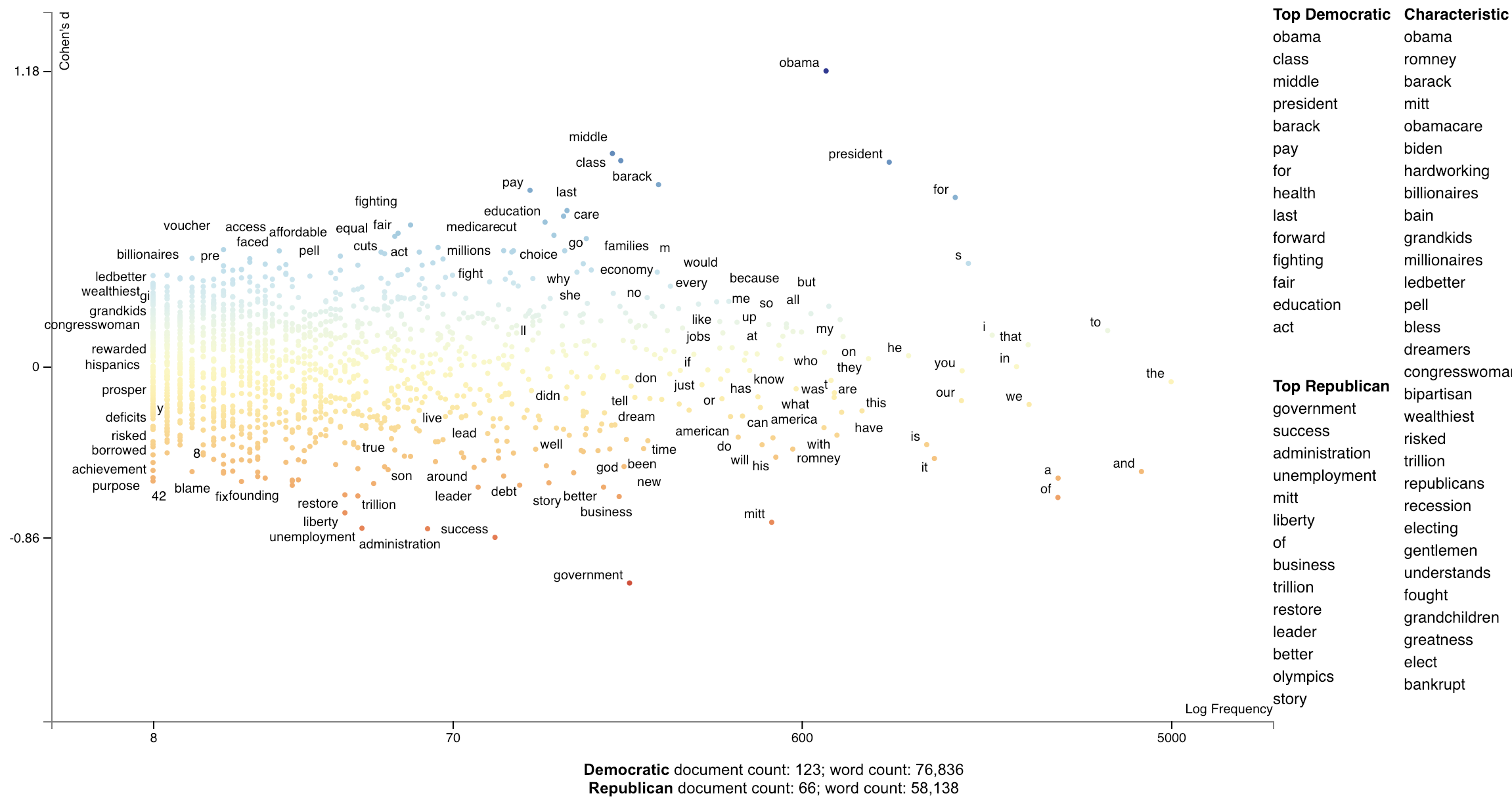
Cohen's d is a popular metric used to measure effect size. The definitions of Cohen's d and Hedge's $g$ from (Shinichi and Cuthill 2017) are implemented in Scattertext.
>>> convention_df = st.SampleCorpora.ConventionData2012.get_data()
>>> corpus = (st.CorpusFromPandas(convention_df,
...                               category_col='party',
               ...text_col='text',
               ...nlp=st.whitespace_nlp_with_sentences)
....build()
....get_unigram_corpus())
We can create a term scorer object to examine the effect sizes and other metrics.
>> > term_scorer = st.CohensD(corpus).set_categories('democrat', ['republican'])
>> > term_scorer.get_score_df().sort_values(by='cohens_d', ascending=False).head()
cohens_d
cohens_d_se
cohens_d_z
cohens_d_p
hedges_g
hedges_g_se
hedges_g_z
hedges_g_p
m1
m2
obama
1.187378
0.024588
48.290444
0.000000e+00
1.187322
0.018419
64.461363
0.0
0.007778
0.002795


class 0.855859     0.020848   41.052045   0.000000e+00  0.855818     0.017227   49.677688         0.0  0.002222  0.000375


middle
0.826895
0.020553
40.232746
0.000000e+00
0.826857
0.017138
48.245626
0.0
0.002316
0.000400
president
0.820825
0.020492
40.056541
0.000000e+00
0.820786
0.017120
47.942661
0.0
0.010231
0.005369
barack
0.730624
0.019616
37.245725
6.213052e-304
0.730589
0.016862
43.327800
0.0
0.002547
0.000725
Our calculation of Cohen's d is not directly based on term counts. Rather, we divide each document's term counts by the
total number
of terms in the document before calculating the statistics. m1 and m2 are, respectively the mean portions of words
in speeches made by Democrats and Republicans that were the term in question. The effect size (cohens_d) is the
difference between these means divided by the pooled standard deviation. cohens_d_se is the standard error
of the statistic, while cohens_d_z and cohens_d_p are the Z-scores and p-values indicating the statistical
significance of the effect. Corresponding columns are present for Hedge's $g$ a version of Cohen's d adjusted for data set size.
>>> st.produce_frequency_explorer(
    corpus,
    category='democrat',
    category_name='Democratic',
    not_category_name='Republican',
    term_scorer=st.CohensD(corpus),
    metadata=convention_df['speaker'],
    grey_threshold=0
)
Click for an interactive version.
Using Cliff's Delta to visualize effect size
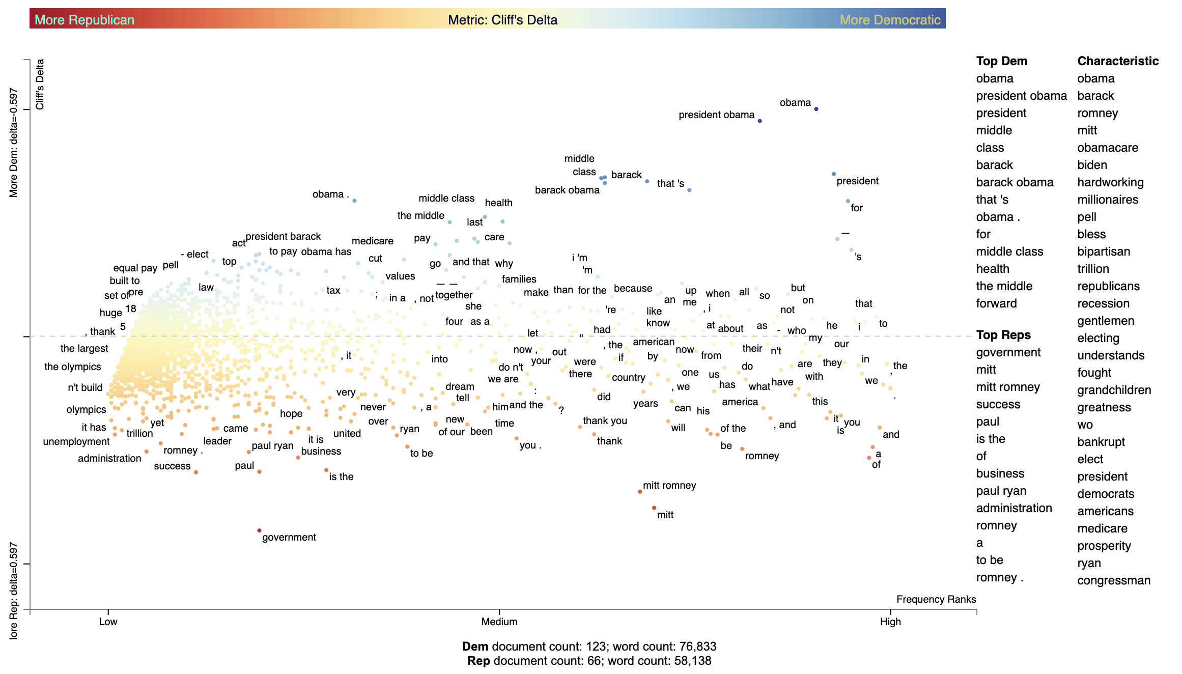
Cliff's Delta (Cliff 1993) uses a non-parametric approach to computing effect size. In our setting, the term's frequency percentage of each document in the focus set is compared with that of the background set. For each pair of documents, a score of 1 is given if the focus document's frequency percentage is larger than the background, 0 if identical, and -1 if different. Note that this assumes document lengths are similarly distributed across the focus and background corpora.
See [https://real-statistics.com/non-parametric-tests/mann-whitney-test/cliffs-delta/] for the formulas used in CliffsDelta.
Below is an example of how to use CliffsDelta to find and plot term scores:
nlp = spacy.blank('en')
nlp.add_pipe('sentencizer')
convention_df = st.SampleCorpora.ConventionData2012.get_data().assign(
   party = lambda df: df.party.apply(
       lambda x: {'democrat': 'Dem', 'republican': 'Rep'}[x]),
   SpacyParse=lambda df: df.text.progress_apply(nlp)
)
corpus = st.CorpusFromParsedDocuments(convention_df, category_col='party', parsed_col='SpacyParse').build(
).remove_terms_used_in_less_than_num_docs(10)
st.CliffsDelta(corpus).set_categories('Dem').get_score_df().sort_values(by='Dem', ascending=False).iloc[:10]
| term | Metric | Stddev | Low-5.0% CI | High-5.0% CI | TermCount1 | TermCount2 | DocCount1 | DocCount2 |
|---|---|---|---|---|---|---|---|---|
| obama | 0.597191 | 0.0266606 | -1.35507 | -1.03477 | 537 | 165 | 113 | 40 |
| president obama | 0.565903 | 0.0314348 | -2.37978 | -1.74131 | 351 | 78 | 100 | 30 |
| president | 0.426337 | 0.0293418 | 1.22784 | 0.909226 | 740 | 301 | 113 | 53 |
| middle | 0.417591 | 0.0267365 | 1.10791 | 0.840932 | 164 | 27 | 68 | 12 |
| class | 0.415373 | 0.0280622 | 1.09032 | 0.815649 | 161 | 25 | 69 | 14 |
| barack | 0.406997 | 0.0281692 | 1.00765 | 0.750963 | 202 | 46 | 76 | 16 |
| barack obama | 0.402562 | 0.027512 | 0.965359 | 0.723403 | 164 | 45 | 76 | 16 |
| that 's | 0.384085 | 0.0227344 | 0.809747 | 0.634705 | 236 | 91 | 89 | 31 |
| obama . | 0.356245 | 0.0237453 | 0.664688 | 0.509631 | 70 | 5 | 49 | 4 |
| for | 0.35526 | 0.0364138 | 0.70142 | 0.46487 | 1020 | 542 | 119 | 62 |
We can elegantly display the Cliff's delta scores using dataframe_scattertext, and describe the point coloring scheme
using the include_gradient=True parameter. We set the left_gradient_term, middle_gradient_term, and right_gradient_term
parameters to strings which will appear in their corresonding values.
plot_df = st.CliffsDelta(
    corpus
).set_categories(
    category_name='Dem'
).get_score_df().rename(columns={'Metric': 'CliffsDelta'}).assign(
    Frequency=lambda df: df.TermCount1 + df.TermCount1,
    X=lambda df: df.Frequency,
    Y=lambda df: df.CliffsDelta,
    Xpos=lambda df: st.Scalers.dense_rank(df.X),
    Ypos=lambda df: st.Scalers.scale_center_zero_abs(df.Y),
    ColorScore=lambda df: df.Ypos,
)

html = st.dataframe_scattertext(
    corpus,
    plot_df=plot_df,
    category='Dem',
    category_name='Dem',
    not_category_name='Rep',
    width_in_pixels=1000,
    ignore_categories=False,
    metadata=lambda corpus: corpus.get_df()['speaker'],
    color_score_column='ColorScore',
    left_list_column='ColorScore',
    show_characteristic=False,
    y_label="Cliff's Delta",
    x_label='Frequency Ranks',
    y_axis_labels=[f'More Rep: delta={plot_df.CliffsDelta.max():.3f}',
                   '',
                   f'More Dem: delta={-plot_df.CliffsDelta.max():.3f}'],
    tooltip_columns=['Frequency', 'CliffsDelta'],
    term_description_columns=['CliffsDelta', 'Stddev', 'Low-95.0% CI', 'High-95.0% CI'],
    header_names={'upper': 'Top Dem', 'lower': 'Top Reps'},
    horizontal_line_y_position=0,
    include_gradient=True,
    left_gradient_term='More Republican',
    right_gradient_term='More Democratic',
    middle_gradient_term="Metric: Cliff's Delta",
)
Using Bi-Normal Separation (BNS) to score terms
Bi-Normal Separation (BNS) (Forman, 2008) was added in version 0.1.8. A variation of (BNS) is used where $F^{-1}(tpr) - F^{-1}(fpr)$ is not used as an absolute value, but kept as a difference. This allows for terms strongly indicative of true positives and false positives to have a high or low score. Note that tpr and fpr are scaled to between $[\alpha, 1-\alpha]$ where alpha is $\in [0, 1]$. In Forman (2008) and earlier literature $\alpha=0.0005$. In personal correspondence with Forman, he kindly suggested using $\frac{1.}{\mbox{minimum(positives, negatives)}}$. I have implemented this as $\alpha=\frac{1.}{\mbox{minimum documents in the least frequent category}}$
corpus = (st.CorpusFromPandas(convention_df,
                              category_col='party',
                              text_col='text',
                              nlp=st.whitespace_nlp_with_sentences)
          .build()
          .get_unigram_corpus()
          .remove_infrequent_words(3, term_ranker=st.OncePerDocFrequencyRanker))

term_scorer = (st.BNSScorer(corpus).set_categories('democrat'))
print(term_scorer.get_score_df().sort_values(by='democrat BNS'))

html = st.produce_frequency_explorer(
    corpus,
    category='democrat',
    category_name='Democratic',
    not_category_name='Republican',
    scores=term_scorer.get_score_df()['democrat BNS'].reindex(corpus.get_terms()).values,
    metadata=lambda c: c.get_df()['speaker'],
    minimum_term_frequency=0,
    grey_threshold=0,
    y_label=f'Bi-normal Separation (alpha={term_scorer.prior_counts})'
)
BNS Scored terms using an algorithmically found alpha. 
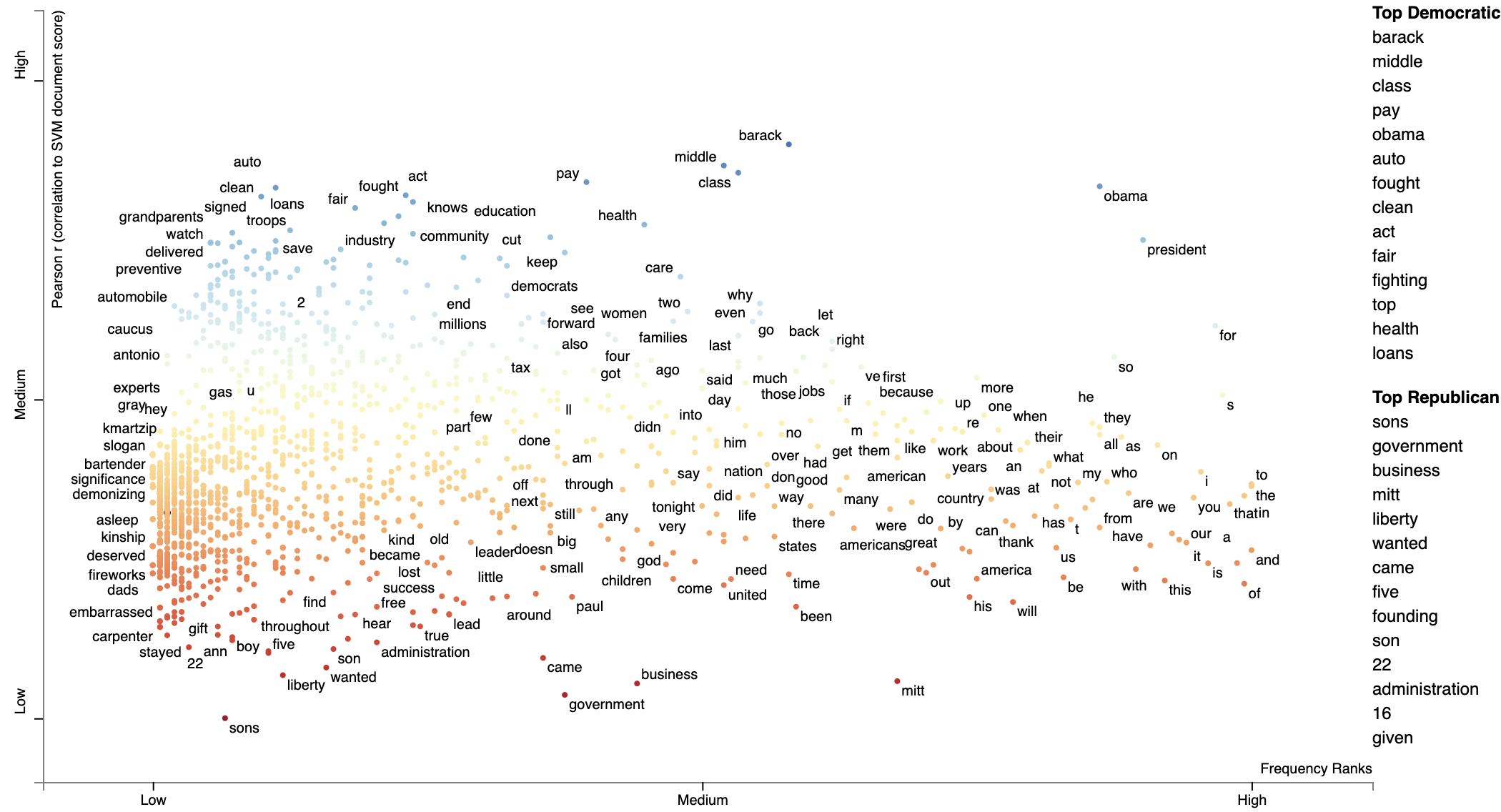
Using correlations to explain classifiers
We can train a classifier to produce a prediction score for each document. Often classifiers or regressors use features which take into account features beyond the ones represented by Scatterext, be they n-gram, topic, extra-linguistic, neural, etc.
We can use Scattertext to visualize the correlations between unigrams (or really any feature representation) and the document scores produced by a model.
In the following example, we train a linear SVM using unigram and bi-gram features on the entire convention data set, and use the model to make a prediction on each document, and finally using Pearson's $r$ to correlate unigram features to the distance from the SVM decision boundary.
from sklearn.svm import LinearSVC

import scattertext as st

df = st.SampleCorpora.ConventionData2012.get_data().assign(
    parse=lambda df: df.text.apply(st.whitespace_nlp_with_sentences)
)

corpus = st.CorpusFromParsedDocuments(
    df, category_col='party', parsed_col='parse'
).build()

X = corpus.get_term_doc_mat()
y = corpus.get_category_ids()

clf = LinearSVC()
clf.fit(X=X, y=y == corpus.get_categories().index('democrat'))
doc_scores = clf.decision_function(X=X)

compactcorpus = corpus.get_unigram_corpus().compact(st.AssociationCompactor(2000))

plot_df = st.Correlations().set_correlation_type(
    'pearsonr'
).get_correlation_df(
    corpus=compactcorpus,
    document_scores=doc_scores
).reindex(compactcorpus.get_terms()).assign(
    X=lambda df: df.Frequency,
    Y=lambda df: df['r'],
    Xpos=lambda df: st.Scalers.dense_rank(df.X),
    Ypos=lambda df: st.Scalers.scale_center_zero_abs(df.Y),
    SuppressDisplay=False,
    ColorScore=lambda df: df.Ypos,
)

html = st.dataframe_scattertext(
    compactcorpus,
    plot_df=plot_df,
    category='democrat',
    category_name='Democratic',
    not_category_name='Republican',
    width_in_pixels=1000,
    metadata=lambda c: c.get_df()['speaker'],
    unified_context=False,
    ignore_categories=False,
    color_score_column='ColorScore',
    left_list_column='ColorScore',
    y_label="Pearson r (correlation to SVM document score)",
    x_label='Frequency Ranks',
    header_names={'upper': 'Top Democratic',
                  'lower': 'Top Republican'},
)
Using Custom Background Word Frequencies
Scattertext relies on a set of general-domain English word frequencies when computing unigram characteristic
scores. When using running Scattertext on non-English data or in a specific domain, the quality of the scores
will degrade.
Ensure that you are on Scattertext 0.1.6 or higher.
To remedy this, one can add a custom set of background scores to a Corpus-like object,
using the Corpus.set_background_corpus function. The function takes a pd.Series object, indexed on
terms with numeric count values.
By default, [!understanding-scaled-f-score](Scaled F-Score) is used to rank how characteristic terms are.
The example below illustrates using Polish background word frequencies.
First, we produce a Series object mapping Polish words to their frequencies using a list from the https://github.com/oprogramador/most-common-words-by-language repo.
polish_word_frequencies = pd.read_csv(
    'https://raw.githubusercontent.com/hermitdave/FrequencyWords/master/content/2016/pl/pl_50k.txt',
    sep=' ',
    names=['Word', 'Frequency']
).set_index('Word')['Frequency']
Note the composition of the Series
>> > polish_word_frequencies
Word
nie
5875385
to
4388099
się
3507076
w
2723767
na
2309765
Name: Frequency, dtype: int64
Next, we build a DataFrame, reviews_df, consisting of document which appear (to a non-Polish speaker) to be
positive and negative hotel reviews from the https://klejbenchmark.com/tasks/ corpus
(Kocoń, et al. 2019). Note this data is under a CC BY-NC-SA 4.0 license. These are labeled as
"__label__meta_plus_m" and "__label__meta_minus_m". We will use Scattertext to compare those
reviews and determine
nlp = spacy.blank('pl')
nlp.add_pipe('sentencizer')

with ZipFile(io.BytesIO(urlopen(
        'https://klejbenchmark.com/static/data/klej_polemo2.0-in.zip'
).read())) as zf:
    review_df = pd.read_csv(zf.open('train.tsv'), sep='\t')[
        lambda df: df.target.isin(['__label__meta_plus_m', '__label__meta_minus_m'])
    ].assign(
        Parse=lambda df: df.sentence.apply(nlp)
    )
Next, we wish to create a ParsedCorpus object from review_df. In preparation, we first assemble a
list of Polish stopwords from the stopwords repository. We also
create the not_a_word regular expression to filter out terms which do not contain a letter.
polish_stopwords = {
    stopword for stopword in
    urlopen(
        'https://raw.githubusercontent.com/bieli/stopwords/master/polish.stopwords.txt'
    ).read().decode('utf-8').split('\n')
    if stopword.strip()
}

not_a_word = re.compile(r'^\W+$')
With these present, we can build a corpus from review_df with the category being the binary
"target" column. We reduce the term space to unigrams and then run the filter_out which
takes a function to determine if a term should be removed from the corpus. The function identifies
terms which are in the Polish stoplist or do not contain a letter. Finally, terms occurring
less than 20 times in the corpus are removed.
We set the background frequency Series we created early as the background corpus.
corpus = st.CorpusFromParsedDocuments(
    review_df,
    category_col='target',
    parsed_col='Parse'
).build(
).get_unigram_corpus(
).filter_out(
    lambda term: term in polish_stopwords or not_a_word.match(term) is not None
).remove_infrequent_words(
    minimum_term_count=20
).set_background_corpus(
    polish_word_frequencies
)
Note that a minimum word count of 20 was chosen to ensure that only around 2,000 terms would be displayed
>> > corpus.get_num_terms()
2023
Running get_term_and_background_counts shows us total term counts in the corpus compare to background
frequency counts. We limit this to terms which only occur in the corpus.
>> > corpus.get_term_and_background_counts()[
    ...
lambda df: df.corpus > 0
...].sort_values(by='corpus', ascending=False)

background
corpus
m
341583838.0
4819.0
hotelu
33108.0
1812.0
hotel
297974790.0
1651.0
doktor
154840.0
1534.0
polecam
0.0
1438.0
.........
szoku
0.0
21.0
badaniem
0.0
21.0
balkonu
0.0
21.0
stopnia
0.0
21.0
wobec
0.0
21.0
Interesting, the term "polecam" appears very frequently in the corpus, but does not appear at all in the background corpus, making it highly characteristic. Judging from Google Translate, it appears to mean something related to "recommend".
We are now ready to display the plot.
html = st.produce_scattertext_explorer(
    corpus,
    category='__label__meta_plus_m',
    category_name='Plus-M',
    not_category_name='Minus-M',
    minimum_term_frequency=1,
    width_in_pixels=1000,
    transform=st.Scalers.dense_rank
)

We can change the formula which is used to produce the Characteristic scores
using the characteristic_scorer parameter to produce_scattertext_explorer.
It takes a instance of a descendant of the CharacteristicScorer class. See
DenseRankCharacteristicness.py
for an example of how to make your own.
Example of plotting with a modified characteristic scorer,
html = st.produce_scattertext_explorer(
    corpus,
    category='__label__meta_plus_m',
    category_name='Plus-M',
    not_category_name='Minus-M',
    minimum_term_frequency=1,
    transform=st.Scalers.dense_rank,
    characteristic_scorer=st.DenseRankCharacteristicness(),
  	term_ranker=st.termranking.AbsoluteFrequencyRanker,
	term_scorer=st.ScaledFScorePresets(beta=1, one_to_neg_one=True)
).encode('utf-8'))
print('open ' + fn)
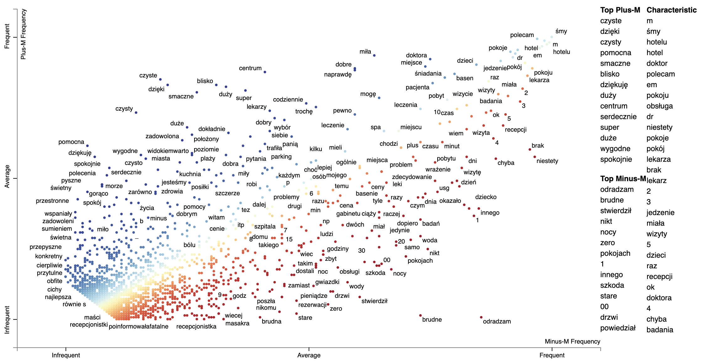
Note that numbers show up as more characteristic using the Dense Rank Difference. It may be they occur unusually frequently in this corpus, or perhaps the background word frequencies under counted mumbers.
Plotting word productivity
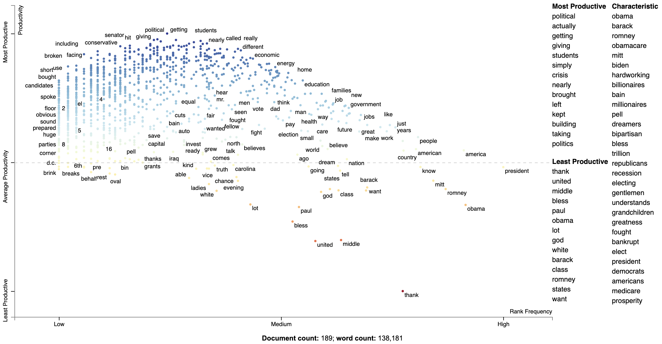
Word productivity is one strategy for plotting word-based charts describing an uncategorized corpus.
Productivity is defined in Schumann (2016) (Jason: check this) as the entropy of ngrams which contain a term. For the entropy computation, the probability of an n-gram wrt the term whose productivity is being calculated is the frequency of the n-gram divided by the term's frequency.
Since productivity highly correlates with frequency, the recommended metric to plot is the dense rank difference between frequency and productivity.
The snippet below plots words in the convention corpus based on their log frequency and their productivity.
The function st.whole_corpus_productivity_scores returns a DataFrame giving each word's productivity. For example,
in the convention corpus,
Productivity scores should be calculated on a Corpus-like object which contains a complete set of unigrams and at
least bigrams. This corpus should not be compacted before the productivity score calculation.
The terms with lower productivity have more limited usage (e.g., "thank" for "thank you", "united" for "united steates") while the terms with higher productivity occurr in a wider varity of contexts ("getting", "actually", "political", etc.).
import spacy
import scattertext as st

corpus_no_cat = st.CorpusWithoutCategoriesFromParsedDocuments(
    st.SampleCorpora.ConventionData2012.get_data().assign(
        Parse=lambda df: [x for x in spacy.load('en_core_web_sm').pipe(df.text)]),
    parsed_col='Parse'
).build()

compact_corpus_no_cat = corpus_no_cat.get_stoplisted_unigram_corpus().remove_infrequent_words(9)

plot_df = st.whole_corpus_productivity_scores(corpus_no_cat).assign(
    RankDelta=lambda df: st.RankDifference().get_scores(
        a=df.Productivity,
        b=df.Frequency
    )
).reindex(
    compact_corpus_no_cat.get_terms()
).dropna().assign(
    X=lambda df: df.Frequency,
    Xpos=lambda df: st.Scalers.log_scale(df.Frequency),
    Y=lambda df: df.RankDelta,
    Ypos=lambda df: st.Scalers.scale(df.RankDelta),
)

html = st.dataframe_scattertext(
    compact_corpus_no_cat.whitelist_terms(plot_df.index),
    plot_df=plot_df,
    metadata=lambda df: df.get_df()['speaker'],
    ignore_categories=True,
    x_label='Rank Frequency',
    y_label="Productivity",
    left_list_column='Ypos',
    color_score_column='Ypos',
    y_axis_labels=['Least Productive', 'Average Productivity', 'Most Productive'],
    header_names={'upper': 'Most Productive', 'lower': 'Least Productive', 'right': 'Characteristic'},
    horizontal_line_y_position=0
)
Understanding Scaled F-Score
Let's now turn our attention to a novel term scoring metric, Scaled F-Score. We'll examine this on a unigram version of the Rotten Tomatoes corpus (Pang et al. 2002). It contains excerpts of positive and negative movie reviews.
Please see Scaled F Score Explanation for a notebook version of this analysis.

from scipy.stats import hmean

term_freq_df = corpus.get_unigram_corpus().get_term_freq_df()[['Positive freq', 'Negative freq']]
term_freq_df = term_freq_df[term_freq_df.sum(axis=1) > 0]

term_freq_df['pos_precision'] = (term_freq_df['Positive freq'] * 1. /
                                 (term_freq_df['Positive freq'] + term_freq_df['Negative freq']))

term_freq_df['pos_freq_pct'] = (term_freq_df['Positive freq'] * 1.
                                / term_freq_df['Positive freq'].sum())

term_freq_df['pos_hmean'] = (term_freq_df
                             .apply(lambda x: (hmean([x['pos_precision'], x['pos_freq_pct']])
                                               if x['pos_precision'] > 0 and x['pos_freq_pct'] > 0
                                               else 0), axis=1))
term_freq_df.sort_values(by='pos_hmean', ascending=False).iloc[:10]

If we plot term frequency on the x-axis and the percentage of a term's occurrences which are in positive documents (i.e., its precision) on the y-axis, we can see that low-frequency terms have a much higher variation in the precision. Given these terms have low frequencies, the harmonic means are low. Thus, the only terms which have a high harmonic mean are extremely frequent words which tend to all have near average precisions.
freq = term_freq_df.pos_freq_pct.values
prec = term_freq_df.pos_precision.values
html = st.produce_scattertext_explorer(
    corpus.remove_terms(set(corpus.get_terms()) - set(term_freq_df.index)),
    category='Positive',
    not_category_name='Negative',
    not_categories=['Negative'],

    x_label='Portion of words used in positive reviews',
    original_x=freq,
    x_coords=(freq - freq.min()) / freq.max(),
    x_axis_values=[int(freq.min() * 1000) / 1000.,
                   int(freq.max() * 1000) / 1000.],

    y_label='Portion of documents containing word that are positive',
    original_y=prec,
    y_coords=(prec - prec.min()) / prec.max(),
    y_axis_values=[int(prec.min() * 1000) / 1000.,
                   int((prec.max() / 2.) * 1000) / 1000.,
                   int(prec.max() * 1000) / 1000.],
    scores=term_freq_df.pos_hmean.values,

    sort_by_dist=False,
    show_characteristic=False
)
file_name = 'not_normed_freq_prec.html'
open(file_name, 'wb').write(html.encode('utf-8'))
IFrame(src=file_name, width=1300, height=700)


from scipy.stats import norm


def normcdf(x):
    return norm.cdf(x, x.mean(), x.std())


term_freq_df['pos_precision_normcdf'] = normcdf(term_freq_df.pos_precision)

term_freq_df['pos_freq_pct_normcdf'] = normcdf(term_freq_df.pos_freq_pct.values)

term_freq_df['pos_scaled_f_score'] = hmean(
    [term_freq_df['pos_precision_normcdf'], term_freq_df['pos_freq_pct_normcdf']])

term_freq_df.sort_values(by='pos_scaled_f_score', ascending=False).iloc[:10]

freq = term_freq_df.pos_freq_pct_normcdf.values
prec = term_freq_df.pos_precision_normcdf.values
html = st.produce_scattertext_explorer(
    corpus.remove_terms(set(corpus.get_terms()) - set(term_freq_df.index)),
    category='Positive',
    not_category_name='Negative',
    not_categories=['Negative'],

    x_label='Portion of words used in positive reviews (norm-cdf)',
    original_x=freq,
    x_coords=(freq - freq.min()) / freq.max(),
    x_axis_values=[int(freq.min() * 1000) / 1000.,
                   int(freq.max() * 1000) / 1000.],

    y_label='documents containing word that are positive (norm-cdf)',
    original_y=prec,
    y_coords=(prec - prec.min()) / prec.max(),
    y_axis_values=[int(prec.min() * 1000) / 1000.,
                   int((prec.max() / 2.) * 1000) / 1000.,
                   int(prec.max() * 1000) / 1000.],
    scores=term_freq_df.pos_scaled_f_score.values,

    sort_by_dist=False,
    show_characteristic=False
)


term_freq_df['neg_precision_normcdf'] = normcdf((term_freq_df['Negative freq'] * 1. /
                                                 (term_freq_df['Negative freq'] + term_freq_df['Positive freq'])))

term_freq_df['neg_freq_pct_normcdf'] = normcdf((term_freq_df['Negative freq'] * 1.
                                                / term_freq_df['Negative freq'].sum()))

term_freq_df['neg_scaled_f_score'] = hmean(
    [term_freq_df['neg_precision_normcdf'], term_freq_df['neg_freq_pct_normcdf']])

term_freq_df['scaled_f_score'] = 0
term_freq_df.loc[term_freq_df['pos_scaled_f_score'] > term_freq_df['neg_scaled_f_score'],
                 'scaled_f_score'] = term_freq_df['pos_scaled_f_score']
term_freq_df.loc[term_freq_df['pos_scaled_f_score'] < term_freq_df['neg_scaled_f_score'],
                 'scaled_f_score'] = 1 - term_freq_df['neg_scaled_f_score']
term_freq_df['scaled_f_score'] = 2 * (term_freq_df['scaled_f_score'] - 0.5)
term_freq_df.sort_values(by='scaled_f_score', ascending=True).iloc[:10]

is_pos = term_freq_df.pos_scaled_f_score > term_freq_df.neg_scaled_f_score
freq = term_freq_df.pos_freq_pct_normcdf * is_pos - term_freq_df.neg_freq_pct_normcdf * ~is_pos
prec = term_freq_df.pos_precision_normcdf * is_pos - term_freq_df.neg_precision_normcdf * ~is_pos


def scale(ar):
    return (ar - ar.min()) / (ar.max() - ar.min())


def close_gap(ar):
    ar[ar > 0] -= ar[ar > 0].min()
    ar[ar < 0] -= ar[ar < 0].max()
    return ar


html = st.produce_scattertext_explorer(
    corpus.remove_terms(set(corpus.get_terms()) - set(term_freq_df.index)),
    category='Positive',
    not_category_name='Negative',
    not_categories=['Negative'],

    x_label='Frequency',
    original_x=freq,
    x_coords=scale(close_gap(freq)),
    x_axis_labels=['Frequent in Neg',
                   'Not Frequent',
                   'Frequent in Pos'],

    y_label='Precision',
    original_y=prec,
    y_coords=scale(close_gap(prec)),
    y_axis_labels=['Neg Precise',
                   'Imprecise',
                   'Pos Precise'],

    scores=(term_freq_df.scaled_f_score.values + 1) / 2,
    sort_by_dist=False,
    show_characteristic=False
)

We can use st.ScaledFScorePresets as a term scorer to display terms' Scaled F-Score on the y-axis and
term frequencies on the x-axis.
html = st.produce_frequency_explorer(
    corpus.remove_terms(set(corpus.get_terms()) - set(term_freq_df.index)),
    category='Positive',
    not_category_name='Negative',
    not_categories=['Negative'],
    term_scorer=st.ScaledFScorePresets(beta=1, one_to_neg_one=True),
    metadata=rdf['movie_name'],
    grey_threshold=0
)

Alternative term scoring methods
Scaled F-Score is not the only scoring method included in Scattertext. Please click on one of the links below to view a notebook which describes how other class association scores work and can be visualized through Scattertext.
- Google Colab Notebook (recommend).
- Jupyter Notebook via NBViewer.
New in 0.0.2.73 is the delta JS-Divergence scorer DeltaJSDivergence scorer (Gallagher et al. 2020), and its
corresponding compactor (JSDCompactor.) See demo_deltajsd.py for an example usage.
The position-select-plot process
New in 0.0.2.72
Scattertext was originally set up to visualize corpora objects, which are connected sets of documents and terms to visualize. The "compaction" process allows users to eliminate terms which may not be associated with a category using a variety of feature selection methods. The issue with this is that the terms eliminated during the selection process are not taken into account when scaling term positions.
This issue can be mitigated by using the position-select-plot process, where term positions are pre-determined before the selection process is made.
Let's first use the 2012 conventions corpus, update the category names, and create a unigram corpus.
import scattertext as st
import numpy as np

df = st.SampleCorpora.ConventionData2012.get_data().assign(
    parse=lambda df: df.text.apply(st.whitespace_nlp_with_sentences)
).assign(party=lambda df: df['party'].apply({'democrat': 'Democratic', 'republican': 'Republican'}.get))

corpus = st.CorpusFromParsedDocuments(
    df, category_col='party', parsed_col='parse'
).build().get_unigram_corpus()

category_name = 'Democratic'
not_category_name = 'Republican'
Next, let's create a dataframe consisting of the original counts and their log-scale positions.
def get_log_scale_df(corpus, y_category, x_category):
    term_coord_df = corpus.get_term_freq_df('')

    # Log scale term counts (with a smoothing constant) as the initial coordinates
    coord_columns = []
    for category in [y_category, x_category]:
        col_name = category + '_coord'
        term_coord_df[col_name] = np.log(term_coord_df[category] + 1e-6) / np.log(2)
        coord_columns.append(col_name)

    # Scale these coordinates to between 0 and 1
    min_offset = term_coord_df[coord_columns].min(axis=0).min()
    for coord_column in coord_columns:
        term_coord_df[coord_column] -= min_offset
    max_offset = term_coord_df[coord_columns].max(axis=0).max()
    for coord_column in coord_columns:
        term_coord_df[coord_column] /= max_offset
    return term_coord_df


# Get term coordinates from original corpus
term_coordinates = get_log_scale_df(corpus, category_name, not_category_name)
print(term_coordinates)
Here is a preview of the term_coordinates dataframe. The Democrat and
Republican columns contain the term counts, while the _coord columns
contain their logged coordinates. Visualizing 7,973 terms is difficult (but
possible) for people running Scattertext on most computers.
          Democratic  Republican  Democratic_coord  Republican_coord
term
thank            158         205          0.860166          0.872032
you              836         794          0.936078          0.933729
so               337         212          0.894681          0.873562
much              84          76          0.831380          0.826820
very              62          75          0.817543          0.826216
...              ...         ...               ...               ...
precinct           0           2          0.000000          0.661076
godspeed           0           1          0.000000          0.629493
beauty             0           1          0.000000          0.629493
bumper             0           1          0.000000          0.629493
sticker            0           1          0.000000          0.629493

[7973 rows x 4 columns]
We can visualize this full data set by running the following code block. We'll create a custom
Javascript function to populate the tooltip with the original term counts, and create a
Scattertext Explorer where the x and y coordinates and original values are specified from the data
frame. Additionally, we can use show_diagonal=True to draw a dashed diagonal line across the plot area.
You can click the chart below to see the interactive version. Note that it will take a while to load.
# The tooltip JS function. Note that d is is the term data object, and ox and oy are the original x- and y-
# axis counts.
get_tooltip_content = ('(function(d) {return d.term + "
' + not_category_name + ' Count: " ' +
                       '+ d.ox +"
' + category_name + ' Count: " + d.oy})')


html_orig = st.produce_scattertext_explorer(
    corpus,
    category=category_name,
    not_category_name=not_category_name,
    minimum_term_frequency=0,
    pmi_threshold_coefficient=0,
    width_in_pixels=1000,
    metadata=corpus.get_df()['speaker'],
    show_diagonal=True,
    original_y=term_coordinates[category_name],
    original_x=term_coordinates[not_category_name],
    x_coords=term_coordinates[category_name + '_coord'],
    y_coords=term_coordinates[not_category_name + '_coord'],
    max_overlapping=3,
    use_global_scale=True,
    get_tooltip_content=get_tooltip_content,
)

Next, we can visualize the compacted version of the corpus. The compaction, using ClassPercentageCompactor,
selects terms which frequently in each category. The term_count parameter, set to 2, is used to determine
the percentage threshold for terms to keep in a particular category. This is done using by calculating the
percentile of terms (types) in each category which appear more than two times. We find the smallest percentile,
and only include terms which occur above that percentile in a given category.
Note that this compaction leaves only 2,828 terms. This number is much easier for Scattertext to display in a browser.
# Select terms which appear a minimum threshold in both corpora
compact_corpus = corpus.compact(st.ClassPercentageCompactor(term_count=2))

# Only take term coordinates of terms remaining in corpus
term_coordinates = term_coordinates.loc[compact_corpus.get_terms()]

html_compact = st.produce_scattertext_explorer(
    compact_corpus,
    category=category_name,
    not_category_name=not_category_name,
    minimum_term_frequency=0,
    pmi_threshold_coefficient=0,
    width_in_pixels=1000,
    metadata=corpus.get_df()['speaker'],
    show_diagonal=True,
    original_y=term_coordinates[category_name],
    original_x=term_coordinates[not_category_name],
    x_coords=term_coordinates[category_name + '_coord'],
    y_coords=term_coordinates[not_category_name + '_coord'],
    max_overlapping=3,
    use_global_scale=True,
    get_tooltip_content=get_tooltip_content,
)

Advanced uses
Visualizing differences based on only term frequencies
Occasionally, only term frequency statistics are available. This may happen in the case of very large,
lost, or proprietary data sets. TermCategoryFrequencies is a corpus representation,that can accept this
sort of data, along with any categorized documents that happen to be available.
Let use the Corpus of Contemporary American English as an example.
We'll construct a visualization
to analyze the difference between spoken American English and English that occurs in fiction.
df = (pd.read_excel('https://www.wordfrequency.info/files/genres_sample.xls')
      .dropna()
      .set_index('lemma')[['SPOKEN', 'FICTION']]
      .iloc[:1000])
df.head()
'''
       SPOKEN    FICTION
lemma
the    3859682.0  4092394.0
I      1346545.0  1382716.0
they   609735.0   352405.0
she    212920.0   798208.0
would  233766.0   229865.0
'''
Transforming this into a visualization is extremely easy. Just pass a dataframe indexed on
terms with columns indicating category-counts into the the TermCategoryFrequencies constructor.
term_cat_freq = st.TermCategoryFrequencies(df)
And call produce_scattertext_explorer normally:
html = st.produce_scattertext_explorer(
    term_cat_freq,
    category='SPOKEN',
    category_name='Spoken',
    not_category_name='Fiction',
)
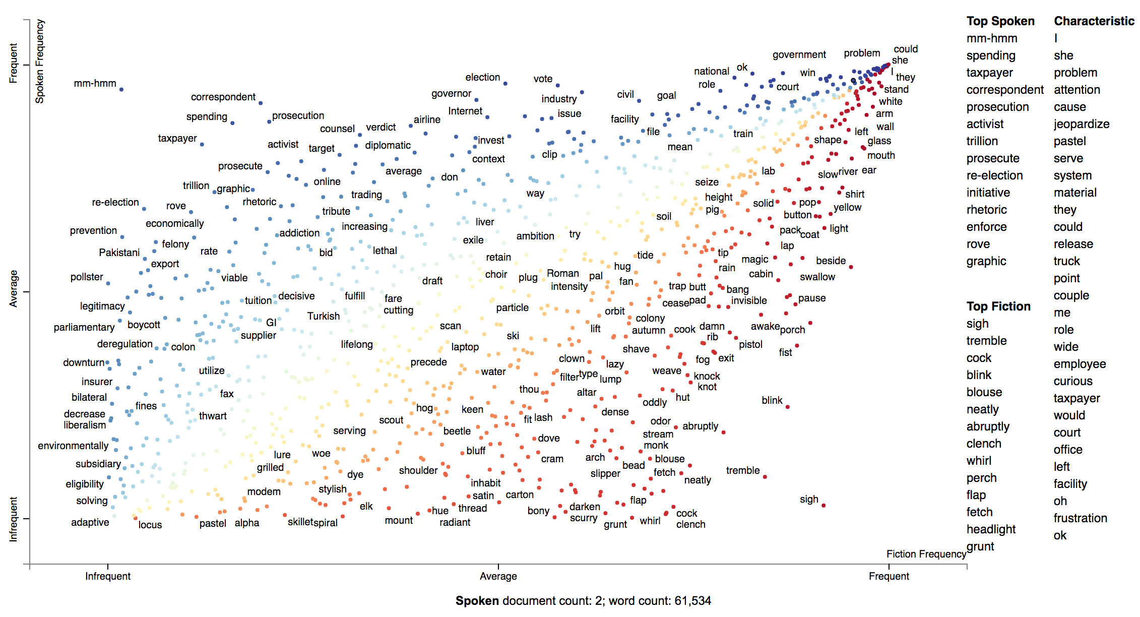
If you'd like to incorporate some documents into the visualization, you can add them into to the
TermCategoyFrequencies object.
First, let's extract some example Fiction and Spoken documents from the sample COCA corpus.
import requests, zipfile, io

coca_sample_url = 'http://corpus.byu.edu/cocatext/samples/text.zip'
zip_file = zipfile.ZipFile(io.BytesIO(requests.get(coca_sample_url).content))

document_df = pd.DataFrame(
    [{'text': zip_file.open(fn).read().decode('utf-8'),
      'category': 'SPOKEN'}
     for fn in zip_file.filelist if fn.filename.startswith('w_spok')][:2]
    + [{'text': zip_file.open(fn).read().decode('utf-8'),
        'category': 'FICTION'}
       for fn in zip_file.filelist if fn.filename.startswith('w_fic')][:2])
And we'll pass the documents_df dataframe into TermCategoryFrequencies via the document_category_df
parameter. Ensure the dataframe has two columns, 'text' and 'category'. Afterward, we can
call produce_scattertext_explorer (or your visualization function of choice) normally.
doc_term_cat_freq = st.TermCategoryFrequencies(df, document_category_df=document_df)

html = st.produce_scattertext_explorer(
    doc_term_cat_freq,
    category='SPOKEN',
    category_name='Spoken',
    not_category_name='Fiction',
)
Visualizing query-based categorical differences
Word representations have recently become a hot topic in NLP. While lots of work has been done visualizing how terms relate to one another given their scores (e.g., http://projector.tensorflow.org/), none to my knowledge has been done visualizing how we can use these to examine how document categories differ.
In this example given a query term, "jobs", we can see how Republicans and Democrats talk about it differently.
In this configuration of Scattertext, words are colored by their similarity to a query phrase.
This is done using spaCy-provided GloVe word vectors (trained on
the Common Crawl corpus). The cosine distance between vectors is used,
with mean vectors used for phrases.
The calculation of the most similar terms associated with each category is a simple heuristic. First, sets of terms closely associated with a category are found. Second, these terms are ranked based on their similarity to the query, and the top rank terms are displayed to the right of the scatterplot.
A term is considered associated if its p-value is less than 0.05. P-values are determined using Monroe et al. (2008)'s difference in the weighted log-odds-ratios with an uninformative Dirichlet prior. This is the only model-based method discussed in Monroe et al. that does not rely on a large, in-domain background corpus. Since we are scoring bigrams in addition to the unigrams scored by Monroe, the size of the corpus would have to be larger to have high enough bigram counts for proper penalization. This function relies the Dirichlet distribution's parameter alpha, a vector, which is uniformly set to 0.01.
Here is the code to produce such a visualization.
>>> from scattertext import word_similarity_explorer
>>> html = word_similarity_explorer(corpus,
...                                 category='democrat',
...                                 category_name='Democratic',
...                                 not_category_name='Republican',
...                                 target_term='jobs',
...                                 minimum_term_frequency=5,
...                                 pmi_threshold_coefficient=4,
...                                 width_in_pixels=1000,
...                                 metadata=convention_df['speaker'],
...                                 alpha=0.01,
...                                 max_p_val=0.05,
...                                 save_svg_button=True)
>>> open("Convention-Visualization-Jobs.html", 'wb').write(html.encode('utf-8'))
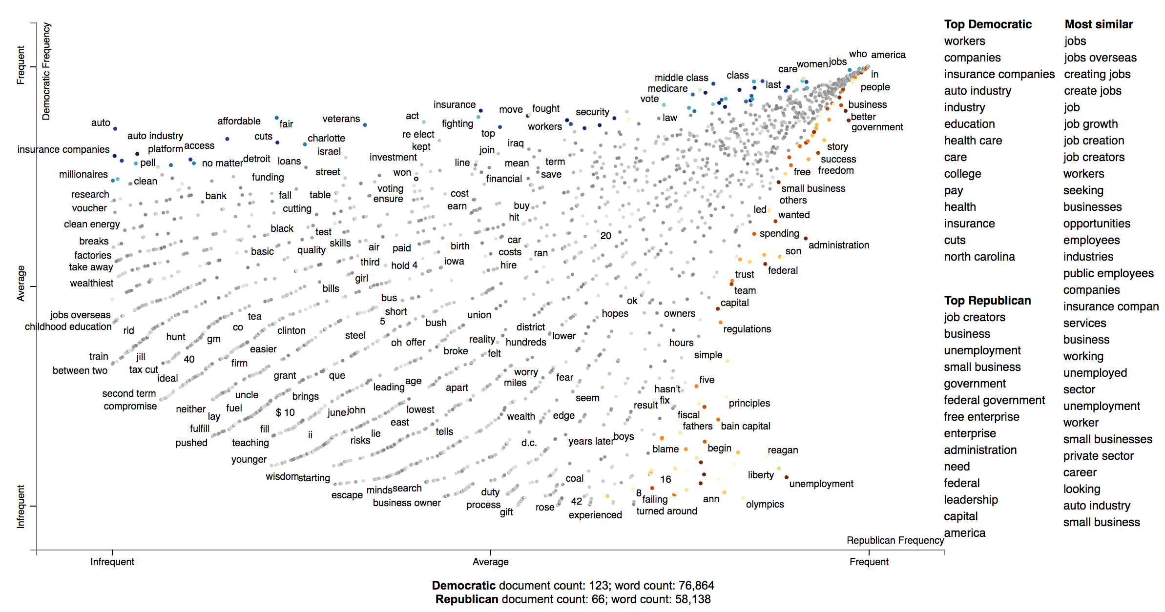
Developing and using bespoke word representations
Scattertext can interface with Gensim Word2Vec models. For example, here's a snippet from demo_gensim_similarity.py
which illustrates how to train and use a word2vec model on a corpus. Note the similarities produced
reflect quirks of the corpus, e.g., "8" tends to refer to the 8% unemployment rate at the time of the
convention.
import spacy
from gensim.models import word2vec
from scattertext import SampleCorpora, word_similarity_explorer_gensim, Word2VecFromParsedCorpus
from scattertext.CorpusFromParsedDocuments import CorpusFromParsedDocuments

nlp = spacy.en.English()
convention_df = SampleCorpora.ConventionData2012.get_data()
convention_df['parsed'] = convention_df.text.apply(nlp)
corpus = CorpusFromParsedDocuments(convention_df, category_col='party', parsed_col='parsed').build()
model = word2vec.Word2Vec(size=300,
                          alpha=0.025,
                          window=5,
                          min_count=5,
                          max_vocab_size=None,
                          sample=0,
                          seed=1,
                          workers=1,
                          min_alpha=0.0001,
                          sg=1,
                          hs=1,
                          negative=0,
                          cbow_mean=0,
                          iter=1,
                          null_word=0,
                          trim_rule=None,
                          sorted_vocab=1)
html = word_similarity_explorer_gensim(corpus,
                                       category='democrat',
                                       category_name='Democratic',
                                       not_category_name='Republican',
                                       target_term='jobs',
                                       minimum_term_frequency=5,
                                       pmi_threshold_coefficient=4,
                                       width_in_pixels=1000,
                                       metadata=convention_df['speaker'],
                                       word2vec=Word2VecFromParsedCorpus(corpus, model).train(),
                                       max_p_val=0.05,
                                       save_svg_button=True)
open('./demo_gensim_similarity.html', 'wb').write(html.encode('utf-8'))
How Democrats and Republicans talked differently about "jobs" in their 2012 convention speeches.
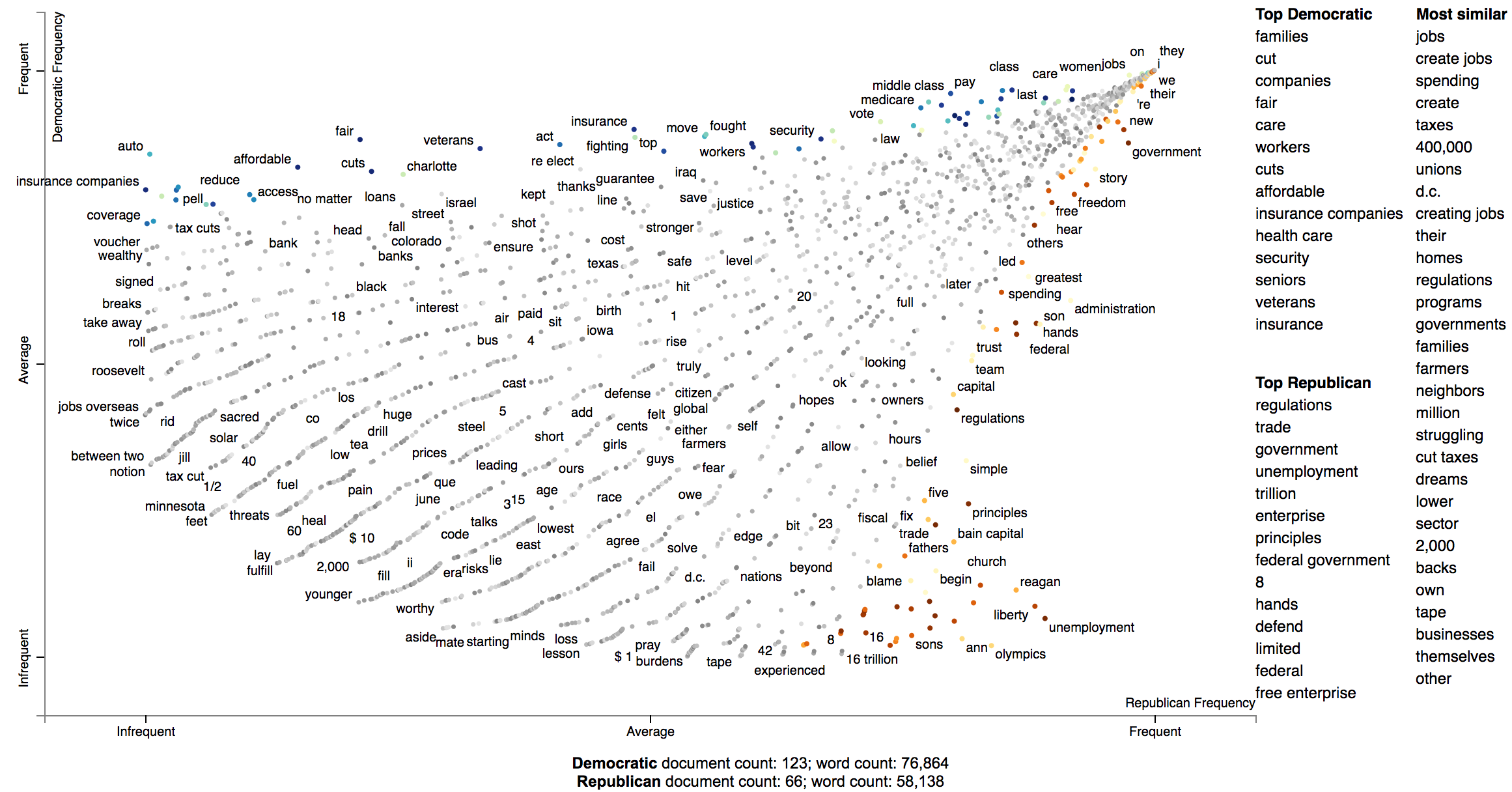
Visualizing any kind of term score
We can use Scattertext to visualize alternative types of word scores, and ensure that 0 scores are greyed out. Use
the sparse_explroer function to acomplish this, and see its source code for more details.
>>> from sklearn.linear_model import Lasso
>>> from scattertext import sparse_explorer
>>> html = sparse_explorer(corpus,
...                        category='democrat',
...                        category_name='Democratic',
...                        not_category_name='Republican',
...                        scores = corpus.get_regression_coefs('democrat', Lasso(max_iter=10000)),
...                        minimum_term_frequency=5,
...                        pmi_threshold_coefficient=4,
...                        width_in_pixels=1000,
...                        metadata=convention_df['speaker'])
>>> open('./Convention-Visualization-Sparse.html', 'wb').write(html.encode('utf-8'))
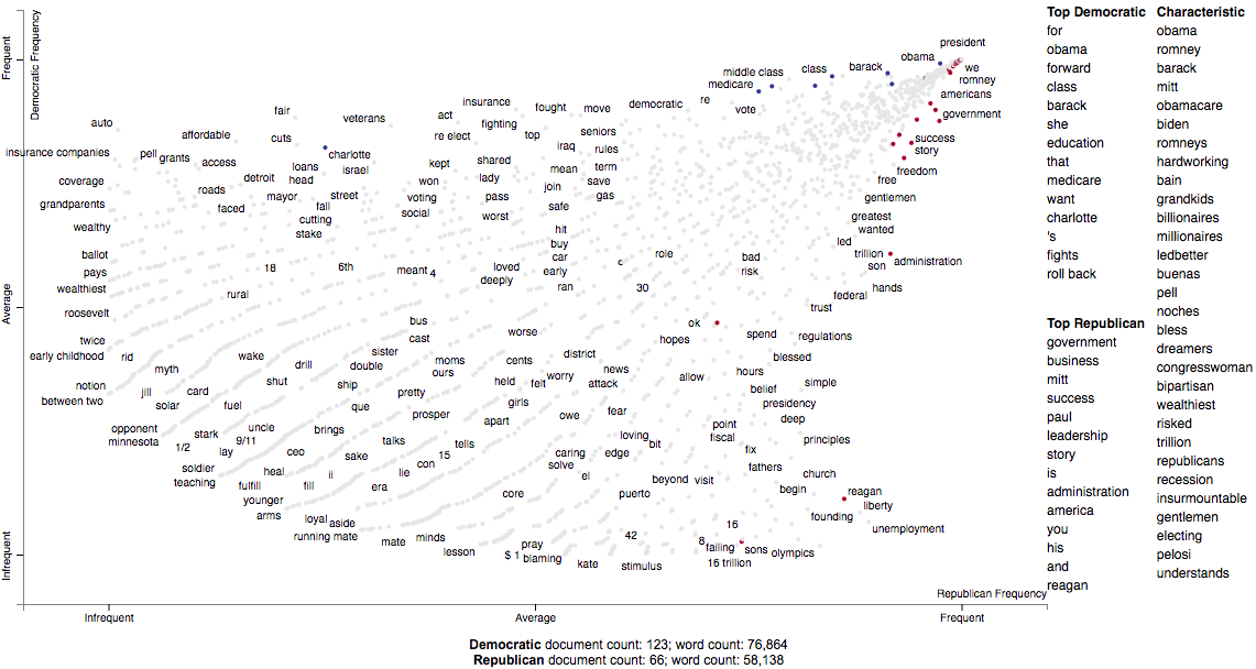
Custom term positions
You can also use custom term positions and axis labels. For example, you can base terms' y-axis positions on a regression coefficient and their x-axis on term frequency and label the axes accordingly. The one catch is that axis positions must be scaled between 0 and 1.
First, let's define two scaling functions: scale to project positive values to [0,1], and
zero_centered_scale project real values to [0,1], with negative values always <0.5, and
positive values always >0.5.
>>> def scale(ar):
...     return (ar - ar.min()) / (ar.max() - ar.min())
...
>>> def zero_centered_scale(ar):
...     ar[ar > 0] = scale(ar[ar > 0])
...     ar[ar < 0] = -scale(-ar[ar < 0])
...     return (ar + 1) / 2.
Next, let's compute and scale term frequencies and L2-penalized regression coefficients. We'll hang on to the original coefficients and allow users to view them by mousing over terms.
>>> from sklearn.linear_model import LogisticRegression
>>> import numpy as np
>>>
>>> frequencies_scaled = scale(np.log(term_freq_df.sum(axis=1).values))
>>> scores = corpus.get_logreg_coefs('democrat',
...                                  LogisticRegression(penalty='l2', C=10, max_iter=10000, n_jobs=-1))
>>> scores_scaled = zero_centered_scale(scores)
Finally, we can write the visualization. Note the use of the x_coords and y_coords
parameters to store the respective coordinates, the scores and sort_by_dist arguments
to register the original coefficients and use them to rank the terms in the right-hand
list, and the x_label and y_label arguments to label axes.
>>> html = produce_scattertext_explorer(corpus,
...                                     category='democrat',
...                                     category_name='Democratic',
...                                     not_category_name='Republican',
...                                     minimum_term_frequency=5,
...                                     pmi_threshold_coefficient=4,
...                                     width_in_pixels=1000,
...                                     x_coords=frequencies_scaled,
...                                     y_coords=scores_scaled,
...                                     scores=scores,
...                                     sort_by_dist=False,
...                                     metadata=convention_df['speaker'],
...                                     x_label='Log frequency',
...                                     y_label='L2-penalized logistic regression coef')
>>> open('demo_custom_coordinates.html', 'wb').write(html.encode('utf-8'))
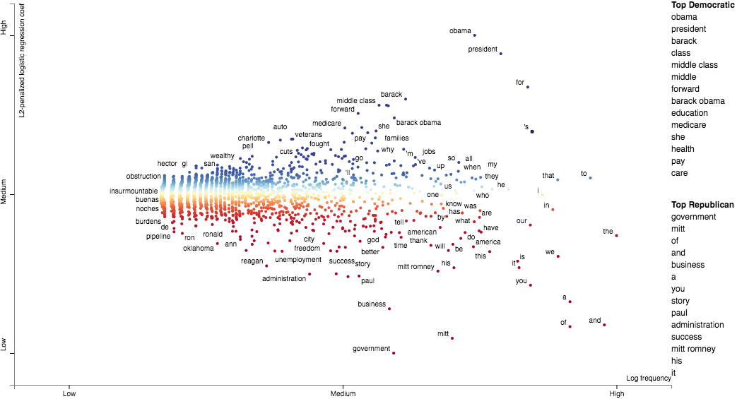
Emoji analysis
The Emoji analysis capability displays a chart of the category-specific distribution of Emoji. Let's look at a new corpus, a set of tweets. We'll build a visualization showing how men and women use emoji differently.
Note: the following example is implemented in demo_emoji.py.
First, we'll load the dataset and parse it using NLTK's tweet tokenizer. Note, install NLTK before running this example. It will take some time for the dataset to download.
import nltk, urllib.request, io, agefromname, zipfile
import scattertext as st
import pandas as pd

with zipfile.ZipFile(io.BytesIO(urllib.request.urlopen(
        'http://followthehashtag.com/content/uploads/USA-Geolocated-tweets-free-dataset-Followthehashtag.zip'
).read())) as zf:
    df = pd.read_excel(zf.open('dashboard_x_usa_x_filter_nativeretweets.xlsx'))

nlp = st.tweet_tokenzier_factory(nltk.tokenize.TweetTokenizer())
df['parse'] = df['Tweet content'].apply(nlp)

df.iloc[0]
'''
Tweet Id                                                     721318437075685382
Date                                                                 2016-04-16
Hour                                                                      12:44
User Name                                                        Bill Schulhoff
Nickname                                                          BillSchulhoff
Bio                           Husband,Dad,GrandDad,Ordained Minister, Umpire...
Tweet content                 Wind 3.2 mph NNE. Barometer 30.20 in, Rising s...
Favs                                                                        NaN
RTs                                                                         NaN
Latitude                                                                40.7603
Longitude                                                              -72.9547
Country                                                                      US
Place (as appears on Bio)                                    East Patchogue, NY
Profile picture               http://pbs.twimg.com/profile_images/3788000007...
Followers                                                                   386
Following                                                                   705
Listed                                                                       24
Tweet language (ISO 639-1)                                                   en
Tweet Url                     http://www.twitter.com/BillSchulhoff/status/72...
parse                         Wind 3.2 mph NNE. Barometer 30.20 in, Rising s...
Name: 0, dtype: object
'''
Next, we'll use the AgeFromName package to find the probabilities of the
gender of
each user given their first name. First, we'll find a dataframe indexed on first names
that contains the probability that each someone with that first name is male (male_prob).
male_prob = agefromname.AgeFromName().get_all_name_male_prob()
male_prob.iloc[0]
'''
hi      1.00000
lo      0.95741
prob    1.00000
Name: aaban, dtype: float64
'''
Next, we'll extract the first names of each user, and use the male_prob data frame
to find users whose names indicate there is at least a 90% chance they are either male or female,
label those users, and create new data frame df_mf with only those users.
df['first_name'] = df['User Name'].apply(lambda x: x.split()[0].lower() if type(x) == str and len(x.split()) > 0 else x)
df_aug = pd.merge(df, male_prob, left_on='first_name', right_index=True)
df_aug['gender'] = df_aug['prob'].apply(lambda x: 'm' if x > 0.9 else 'f' if x < 0.1 else '?')
df_mf = df_aug[df_aug['gender'].isin(['m', 'f'])]
The key to this analysis is to construct a corpus using only the emoji
extractor st.FeatsFromSpacyDocOnlyEmoji which builds a corpus only from
emoji and not from anything else.
corpus = st.CorpusFromParsedDocuments(
    df_mf,
    parsed_col='parse',
    category_col='gender',
    feats_from_spacy_doc=st.FeatsFromSpacyDocOnlyEmoji()
).build()
Next, we'll run this through a standard produce_scattertext_explorer visualization
generation.
html = st.produce_scattertext_explorer(
    corpus,
    category='f',
    category_name='Female',
    not_category_name='Male',
    use_full_doc=True,
    term_ranker=st.OncePerDocFrequencyRanker,
    sort_by_dist=False,
    metadata=(df_mf['User Name']
              + ' (@' + df_mf['Nickname'] + ') '
              + df_mf['Date'].astype(str)),
    width_in_pixels=1000
)
open("EmojiGender.html", 'wb').write(html.encode('utf-8'))
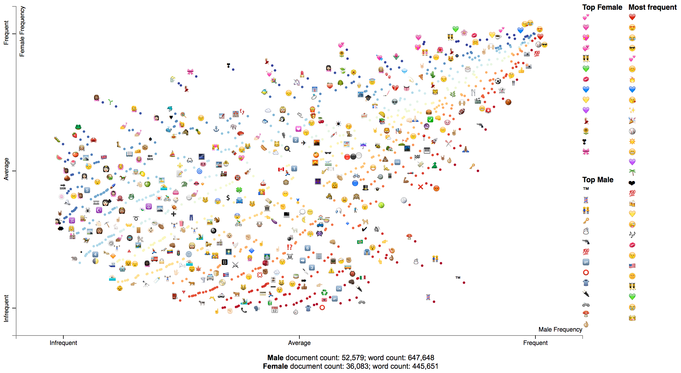
Visualizing SentencePiece Tokens
SentencePiece tokenization is a subword tokenization technique which relies on a language-model to produce optimized tokenization. It has been used in large, transformer-based contextual language models.
Ensure to run $ pip install sentencepiece before running this example.
First, let's load the political convention data set as normal.
import tempfile
import re
import scattertext as st

convention_df = st.SampleCorpora.ConventionData2012.get_data()
convention_df['parse'] = convention_df.text.apply(st.whitespace_nlp_with_sentences)
Next, let's train a SentencePiece tokenizer based on this data. The train_sentence_piece_tokenizer function trains
a SentencePieceProcessor on the data set and returns it. You can of course use any SentencePieceProcessor.
def train_sentence_piece_tokenizer(documents, vocab_size):
    '''
    :param documents: list-like, a list of str documents
    :vocab_size int: the size of the vocabulary to output

    :return sentencepiece.SentencePieceProcessor
    '''
    import sentencepiece as spm
    sp = None
    with tempfile.NamedTemporaryFile(delete=True) as tempf:
        with tempfile.NamedTemporaryFile(delete=True) as tempm:
            tempf.write(('\n'.join(documents)).encode())
            spm.SentencePieceTrainer.Train(
                '--input=%s --model_prefix=%s --vocab_size=%s' % (tempf.name, tempm.name, vocab_size)
            )
            sp = spm.SentencePieceProcessor()
            sp.load(tempm.name + '.model')
    return sp


sp = train_sentence_piece_tokenizer(convention_df.text.values, vocab_size=2000)
Next, let's add the SentencePiece tokens as metadata when creating our corpus. In order to do this, pass
a FeatsFromSentencePiece instance into the feats_from_spacy_doc parameter. Pass the SentencePieceProcessor into
the constructor.
corpus = st.CorpusFromParsedDocuments(convention_df,
                                      parsed_col='parse',
                                      category_col='party',
                                      feats_from_spacy_doc=st.FeatsFromSentencePiece(sp)).build()
Now we can create the SentencePiece token scatter plot.
html = st.produce_scattertext_explorer(
    corpus,
    category='democrat',
    category_name='Democratic',
    not_category_name='Republican',
    sort_by_dist=False,
    metadata=convention_df['party'] + ': ' + convention_df['speaker'],
    term_scorer=st.RankDifference(),
    transform=st.Scalers.dense_rank,
    use_non_text_features=True,
    use_full_doc=True,
)

Visualizing scikit-learn text classification weights
Suppose you'd like to audit or better understand weights or importances given to bag-of-words features by a classifier.
It's easy to use Scattertext to do, if you use a Scikit-learn-style classifier.
For example the Lighting package makes available high-performance linear classifiers which are have Scikit-compatible interfaces.
First, let's import sklearn's text feature extraction classes, the 20 Newsgroup
corpus, Lightning's Primal Coordinate Descent classifier, and Scattertext. We'll also
fetch the training portion of the Newsgroup corpus.
from lightning.classification import CDClassifier
from sklearn.datasets import fetch_20newsgroups
from sklearn.feature_extraction.text import CountVectorizer, TfidfVectorizer

import scattertext as st

newsgroups_train = fetch_20newsgroups(
    subset='train',
    remove=('headers', 'footers', 'quotes')
)
Next, we'll tokenize our corpus twice. Once into tfidf features which will be used to train the classifier, an another time into ngram counts that will be used by Scattertext. It's important that both vectorizers share the same vocabulary, since we'll need to apply the weight vector from the model onto our Scattertext Corpus.
vectorizer = TfidfVectorizer()
tfidf_X = vectorizer.fit_transform(newsgroups_train.data)
count_vectorizer = CountVectorizer(vocabulary=vectorizer.vocabulary_)
Next, we use the CorpusFromScikit factory to build a Scattertext Corpus object.
Ensure the X parameter is a document-by-feature matrix. The argument to the
y parameter is an array of class labels. Each label is an integer representing
a different news group. We the feature_vocabulary is the vocabulary used by the
vectorizers. The category_names are a list of the 20 newsgroup names which
as a class-label list. The raw_texts is a list of the text of newsgroup texts.
corpus = st.CorpusFromScikit(
    X=count_vectorizer.fit_transform(newsgroups_train.data),
    y=newsgroups_train.target,
    feature_vocabulary=vectorizer.vocabulary_,
    category_names=newsgroups_train.target_names,
    raw_texts=newsgroups_train.data
).build()
Now, we can train the model on tfidf_X and the categoricla response variable,
and capture feature weights for category 0 ("alt.atheism").
clf = CDClassifier(penalty="l1/l2",
                   loss="squared_hinge",
                   multiclass=True,
                   max_iter=20,
                   alpha=1e-4,
                   C=1.0 / tfidf_X.shape[0],
                   tol=1e-3)
clf.fit(tfidf_X, newsgroups_train.target)
term_scores = clf.coef_[0]
Finally, we can create a Scattertext plot. We'll use the Monroe-style visualization, and automatically select around 4000 terms that encompass the set of frequent terms, terms with high absolute scores, and terms that are characteristic of the corpus.
html = st.produce_frequency_explorer(
    corpus,
    'alt.atheism',
    scores=term_scores,
    use_term_significance=False,
    terms_to_include=st.AutoTermSelector.get_selected_terms(corpus, term_scores, 4000),
    metadata=['/'.join(fn.split('/')[-2:]) for fn in newsgroups_train.filenames]
)
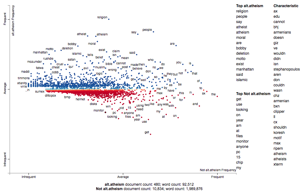
Let's take a look at the performance of the classifier:
newsgroups_test = fetch_20newsgroups(subset='test',
                                     remove=('headers', 'footers', 'quotes'))
X_test = vectorizer.transform(newsgroups_test.data)
pred = clf.predict(X_test)
f1 = f1_score(pred, newsgroups_test.target, average='micro')
print("Microaveraged F1 score", f1)
Microaveraged F1 score 0.662108337759. Not bad over a ~0.05 baseline.
Creating lexicalized semiotic squares
Please see Signo for an introduction to semiotic squares.
Some variants of the semiotic square-creator are can be seen in this notebook, which studies words and phrases in headlines that had low or high Facebook engagement and were published by either BuzzFeed or the New York Times: [http://nbviewer.jupyter.org/github/JasonKessler/PuPPyTalk/blob/master/notebooks/Explore-Headlines.ipynb]
The idea behind the semiotic square is to express the relationship between two opposing concepts and concepts things within a larger domain of a discourse. Examples of opposed concepts life or death, male or female, or, in our example, positive or negative sentiment. Semiotics squares are comprised of four "corners": the upper two corners are the opposing concepts, while the bottom corners are the negation of the concepts.
Circumscribing the negation of a concept involves finding everything in the domain of discourse that isn't associated with the concept. For example, in the life-death opposition, one can consider the universe of discourse to be all animate beings, real and hypothetical. The not-alive category will cover dead things, but also hypothetical entities like fictional characters or sentient AIs.
In building lexicalized semiotic squares, we consider concepts to be documents labeled in a corpus. Documents, in this setting, can belong to one of three categories: two labels corresponding to the opposing concepts, a neutral category, indicating a document is in the same domain as the opposition, but cannot fall into one of opposing categories.
In the example below positive and negative movie reviews are treated as the opposing categories, while plot descriptions of the same movies are treated as the neutral category.
Terms associated with one of the two opposing categories (relative only to the other) are listed as being associated with that category. Terms associated with a netural category (e.g., not positive) are terms which are associated with the disjunction of the opposite category and the neutral category. For example, not-positive terms are those most associated with the set of negative reviews and plot descriptions vs. positive reviews.
Common terms among adjacent corners of the square are also listed.
An HTML-rendered square is accompanied by a scatter plot. Points on the plot are terms. The x-axis is the Z-score of the association to one of the opposed concepts. The y-axis is the Z-score how associated a term is with the neutral set of documents relative to the opposed set. A point's red-blue color indicate the term's opposed-association, while the more desaturated a term is, the more it is associated with the neutral set of documents.
Update to version 2.2: terms are colored by their nearest semiotic categories across the eight corresponding radial sectors.
import scattertext as st

movie_df = st.SampleCorpora.RottenTomatoes.get_data()
movie_df.category = movie_df.category.apply
    (lambda x: {'rotten': 'Negative', 'fresh': 'Positive', 'plot': 'Plot'}[x])
corpus = st.CorpusFromPandas(
    movie_df,
    category_col='category',
    text_col='text',
    nlp=st.whitespace_nlp_with_sentences
).build().get_unigram_corpus()

semiotic_square = st.SemioticSquare(
    corpus,
    category_a='Positive',
    category_b='Negative',
    neutral_categories=['Plot'],
    scorer=st.RankDifference(),
    labels={'not_a_and_not_b': 'Plot Descriptions', 'a_and_b': 'Reviews'}
)

html = st.produce_semiotic_square_explorer(semiotic_square,
                                           category_name='Positive',
                                           not_category_name='Negative',
                                           x_label='Fresh-Rotten',
                                           y_label='Plot-Review',
                                           neutral_category_name='Plot Description',
                                           metadata=movie_df['movie_name'])
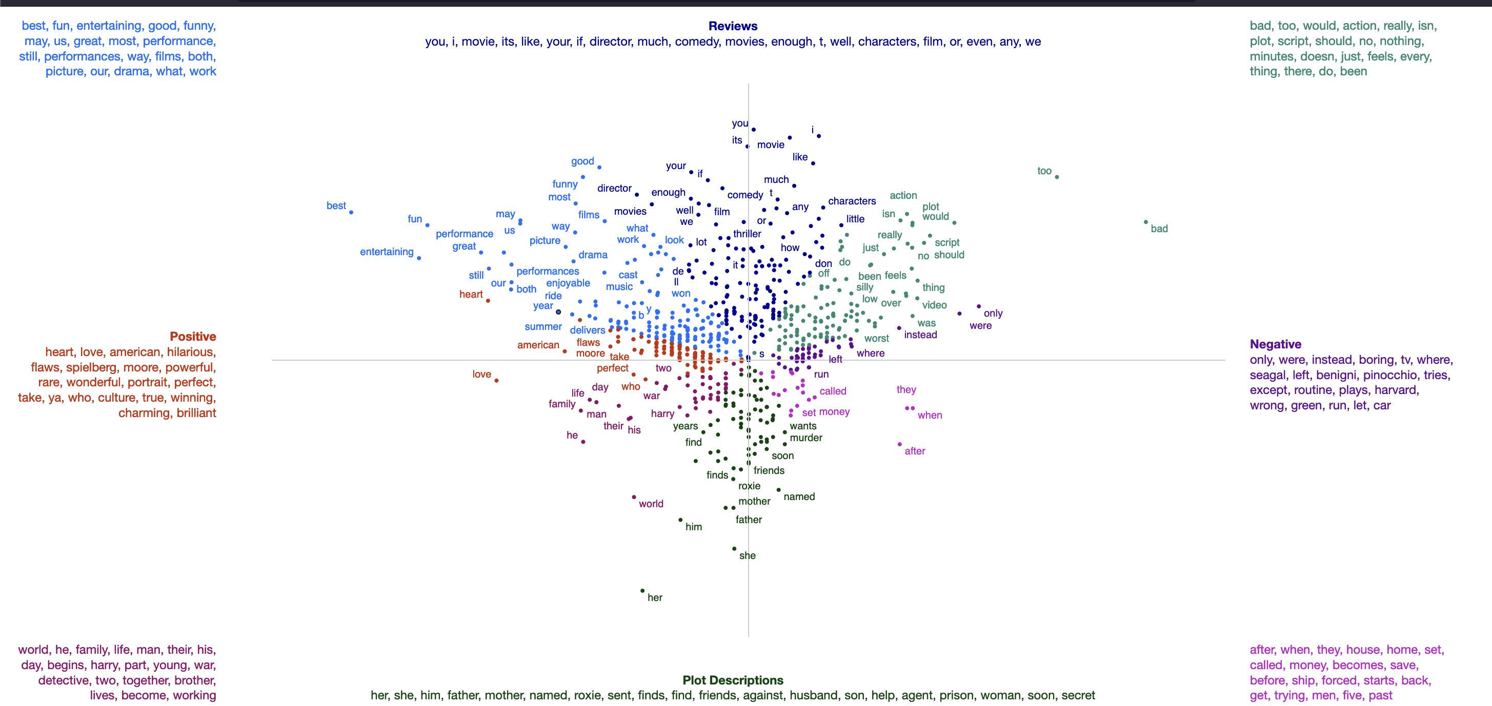
There are a number of other types of semiotic square construction functions. Again, please see https://nbviewer.org/github/JasonKessler/PuPPyTalk/blob/master/notebooks/Explore-Headlines.ipynb for an overview of these.
Visualizing Topic Models
A frequently requested feature of Scattertext has been the ability to visualize topic models. While this capability has existed in some forms (e.g., the Empath visualization), I've finally gotten around to implementing a concise API for such a visualization. There are three main ways to visualize topic models using Scattertext. The first is the simplest: manually entering topic models and visualizing them. The second uses a Scikit-Learn pipeline to produce the topic models for visualization. The third is a novel topic modeling technique, based on finding terms similar to a custom set of seed terms.
Manually entered topic models
If you have already created a topic model, simply structure it as a dictionary. This dictionary is keyed on string which serve as topic titles and are displayed in the main scatterplot. The values are lists of words that belong to that topic. The words that are in each topic list are bolded when they appear in a snippet.
Note that currently, there is no support for keyword scores.
For example, one might manually the following topic models to explore in the Convention corpus:
topic_model = {
    'money': ['money', 'bank', 'banks', 'finances', 'financial', 'loan', 'dollars', 'income'],
    'jobs': ['jobs', 'workers', 'labor', 'employment', 'worker', 'employee', 'job'],
    'patriotic': ['america', 'country', 'flag', 'americans', 'patriotism', 'patriotic'],
    'family': ['mother', 'father', 'mom', 'dad', 'sister', 'brother', 'grandfather', 'grandmother', 'son', 'daughter']
}
We can use the FeatsFromTopicModel class to transform this topic model into one which
can be visualized using Scattertext. This is used just like any other feature builder,
and we pass the topic model object into produce_scattertext_explorer.
import scattertext as st

topic_feature_builder = st.FeatsFromTopicModel(topic_model)

topic_corpus = st.CorpusFromParsedDocuments(
	convention_df,
	category_col='party',
	parsed_col='parse',
	feats_from_spacy_doc=topic_feature_builder
).build()

html = st.produce_scattertext_explorer(
	topic_corpus,
	category='democrat',
	category_name='Democratic',
	not_category_name='Republican',
	width_in_pixels=1000,
	metadata=convention_df['speaker'],
	use_non_text_features=True,
	use_full_doc=True,
	pmi_threshold_coefficient=0,
	topic_model_term_lists=topic_feature_builder.get_top_model_term_lists()
)
[![demo_custom_topic_model.html](https://raw.githubusercontent.com/JasonKessler/jasonkessler